set.seed(444) # Set the seed so that every time I run this I get the same results
x = runif(n=200, min = 40, max = 85) # I am sampling 200 points from a uniform distribution with minimum value 40 and maximum value 85
y = rnorm(n=200, 215 - 0.85*x, 13) # Then I can construct my y-observations based on x. Notice that 215 is the true, underlying intercept and -0.85 is the true underlying slope
df = data.frame(Age = x, HR = y) # Then I combine these into a dataframeMuddy Points
Lesson 9: MLR Intro
Muddy Points from Winter 2026
1. I am confused by the lowercase x1a x1b x2a x2b notation, what does that mean as opposed to the uppercase X1 X2?
The lowercase x’s refer to the observed values of the covariates. So if we have a dataset with 100 observations, then we have 100 \(x_{1}\) and 100 \(x_{2}\). \(x_{1a}\) and \(x_{1b}\) are meant to represent two different observed values (a and b). The uppercase \(X\)’s refer to the population covariates. So we can think of \(X_1\) as being the population covariate that corresponds to the observed \(x_{1a}\) and \(x_{1b}\). Similarly, \(X_2\) is the population covariate that corresponds to the observed \(x_{2a}\) and \(x_{2b}\).
2. I thought the coefficients told us something about the slope (difference in mean Y variable, e.g. the interpretation on slide 19)? but you are saying the coefficients beyond B1 are just changing the intercept? Basically I’m confused about how that B2 interpretation tells us the slope is the same but the intercept is changing.
This is a great question! The coefficients for the covariates beyond the first one (B2, B3, etc.) are not changing the slope of the first covariate (B1). They are comparing one category from our second variable, income level, to the reference category. So they are changing the intercept of the line, but not the slope of the first covariate. The slope of the first covariate (B1) is still telling us how much we expect Y to change for a one unit increase in X1, holding all other covariates constant.
3. Interpreting the regression plane - what was that 3D plot representing?
When we have two independent variables (predictors) in our model, we are trying to fit an equation to the outcome. Since we have two predictors, we are trying to fit a plane to the data. The 3D plot was representing this plane. The x and y axes represent the two predictors, and the z axis represents the outcome. The plane is the best fit plane that minimizes the distance from all the observed points to the plane.
Muddy Points from Winter 2024
1. Why is it not called multivariate?
Multivariate models refer to models that have multiple outcomes. In multiple/multivariable models, we still only have one outcome, \(Y\), but multiple predictors.
2. When adjusting for another variable, how do we calculate the new slope and intercept?
First, I want to clarify one thing: in the case of two covariates, we only have the best fit plane. The intercept is really just a placeholder for when the covariates are 0. And the coefficients for each covariate are no longer stand alone slopes, unless we examine a specific instance when one covariate takes on a realized value. (Okay, that was kinda a lot of vague language. Let’s go to our example.)
For \[\widehat{\text{LE}} = 33.595 + 0.157\ \text{FLR} + 0.008\ \text{FS}\], we have a regression plane.
When we derive the regression lines for either variable, FLR or FS, we can think of the other variable as part of the intercept for the line:
For FLR: \[\widehat{\text{LE}} = [33.595 + 0.008\ \text{FS}] + 0.157\ \text{FLR} \] For FS: \[\widehat{\text{LE}} = [33.595 + 0.157\ \text{FLR}] + 0.008\ \text{FS}\]
For FLR, any given FS value will result in the same slope, but the intercept will change. That’s why we say “holding FS constant,” “adjusting for FS,” or “controlling for FS” when we discuss the \(\widehat\beta_1=0.157\) estimate. Depending on the FS value, the intercept will change. So we can write: \[(\widehat{\text{LE}}|FS=3000) = [33.595 + 0.008\cdot 3000] + 0.157\ \text{FLR}= 57.595 + 0.157\ \text{FLR}\]
Try going through the same process for FS when FLR is 30%.
3. I know we can’t really do visualizations past 3 coefficients but I still can’t really wrap my head around how this will work once we add a third covariate to the model.
Yeah… this is a tough one! You can try to think of the fitted Y \(\widehat{Y}|X\) as being built from all the covariate values, and really just the equation for the best-fit line that we estimate. At three covariates, we need to let go of some of the visualizations.
4. Still a little unsure about OLS
I was going to write out an explanation to this, but then I wrote my explanation to the below question. I honestly think it helps bring context to OLS and talk about it in a new way that might help if it’s been confusing so far.
5. We keep getting back to \(\widehat{Y}\), \(Y_i\), and \(\overline{Y}\) and their relationship to the population parameter estimates. Can you clarify this?
I think it’ll be helpful to use the dataset I created from our quiz. I still think this relationship is best communicated with simple linear regression. What you didn’t see on the quiz was that I simulated the data:
Then we can look at the scatterplot:
library(ggplot2)

ggplot(df, aes(x = x, y = y)) +
  geom_point(size = 1) +
  geom_smooth(method = "lm", se = FALSE, linewidth = 1, colour="#F14124") +
  labs(x = "Age (years)",
       y = "Peak exercise heart rate (bpm)",
       title = "Peak exercise heart rate vs. Age") +
    theme(axis.title = element_text(size = 11),
        axis.text = element_text(size = 11),
        title = element_text(size = 11))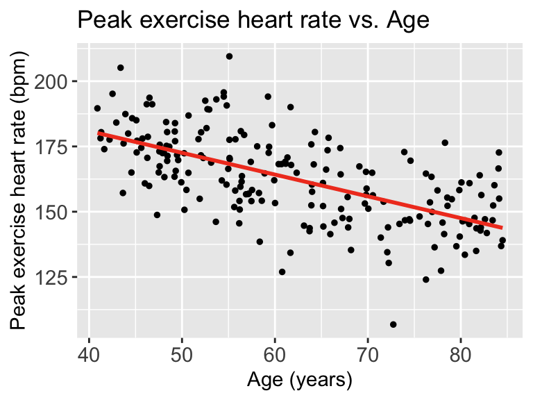
Each point represents an observation \((X_i, Y_i)\). That is where we get \(Y_i\) from
The red line represents \(\widehat{Y}\). We can look at each \(\widehat{Y}|X\), so we look at the expected \(Y\) at a specific age like 70 years old.
Now we need to find \(\overline{Y}\). This does not take \(X\) into account. So we can look at the observed \(Y\)’s and find the mean
ggplot(df, aes(HR)) + geom_histogram()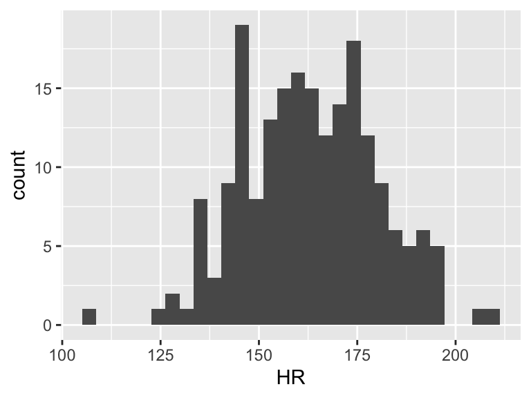
mean(df$HR)[1] 162.8725
Then we can draw a line on the scatterplot for \(\overline{Y}\):
ggplot(df, aes(x = x, y = y)) +
  geom_point(size = 1) +
  geom_smooth(method = "lm", se = FALSE, linewidth = 1, colour="#F14124") +
  labs(x = "Age (years)",
       y = "Peak exercise heart rate (bpm)",
       title = "Peak exercise heart rate vs. Age") +
    theme(axis.title = element_text(size = 11),
        axis.text = element_text(size = 11),
        title = element_text(size = 11)) +
  geom_hline(yintercept = mean(df$HR), linewidth = 1, colour="green")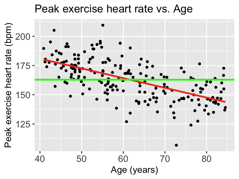
When we talk about SSY (total variation), we can think of the histogram of the Y’s
ggplot(df, aes(HR)) + geom_histogram() + xlim(100, 225)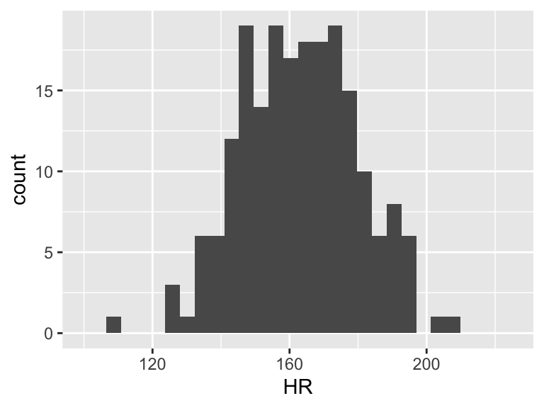
Then the total variation of these observed values is related to the \(\sum_{i=1}^n (Y_i - \overline{Y})^2\). Let’s plot \(Y_i - \overline{Y}\):
df = df %>% mutate(y_center = HR - mean(HR))
ggplot(df, aes(y_center)) + geom_histogram() + xlim(-60, 50)+ylim(0, 35)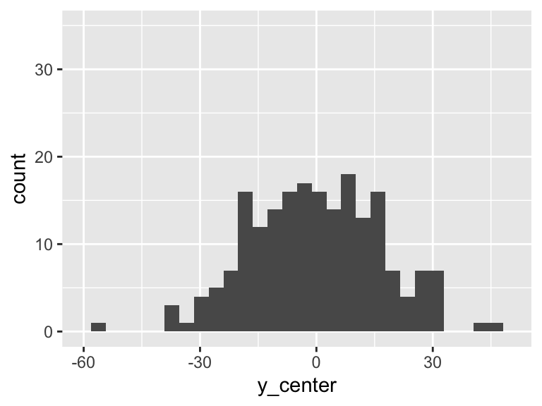
However, we can fit a regression line to show the relationship between Y and X. For every observation \(X_i\) there is a specific \(\widehat{Y}\) from the regression line. So if we take the difference between the mean Y and the fitted Y, then we get the variation that is explained by the regression.
mod1 = lm(HR ~ Age, data = df)
aug1 = augment(mod1)
df = df %>% mutate(fitted_y = aug1$.fitted,
                   diff_mean_fit = fitted_y - mean(HR))
ggplot(df, aes(diff_mean_fit)) + geom_histogram() + xlim(-60, 50)+ylim(0, 35)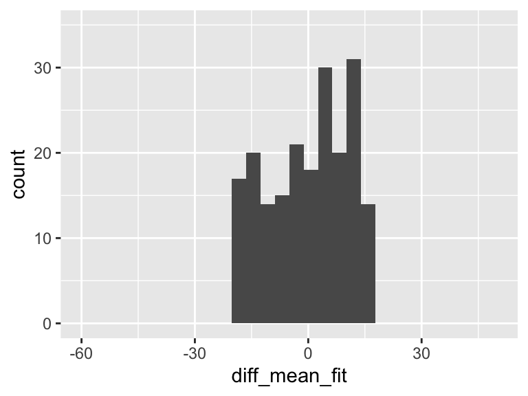
In the plot above, there is variation! And it means that some of the variation in the plot of Y alone is actually coming from this variation explained by the regression model!!
But there is left over variation that is not explained by the model… What is that? It’s related to our residuals: \(\widehat\epsilon_i = Y_i - \widehat{Y}_i\)
So we’ll calculate the residuals (or more appropriately, use the calculation of the residuals that R gave us)
mod1 = lm(HR ~ Age, data = df)
aug1 = augment(mod1)
df = df %>% mutate(diff_y_fitted = aug1$.resid)
ggplot(df, aes(diff_y_fitted)) + geom_histogram() + xlim(-60, 50) +ylim(0, 35)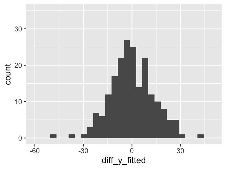
Our aim in regression (through ordinary least squares) is to minimize the variance in the above plot. The more variance our model can explain, the less variance in the residuals. In SLR, we can only explain so much variance with a single predictor. As we include more predictors in our model, the model has the opportunity to explain even MORE variance.