Poster Help Session
2026-03-09
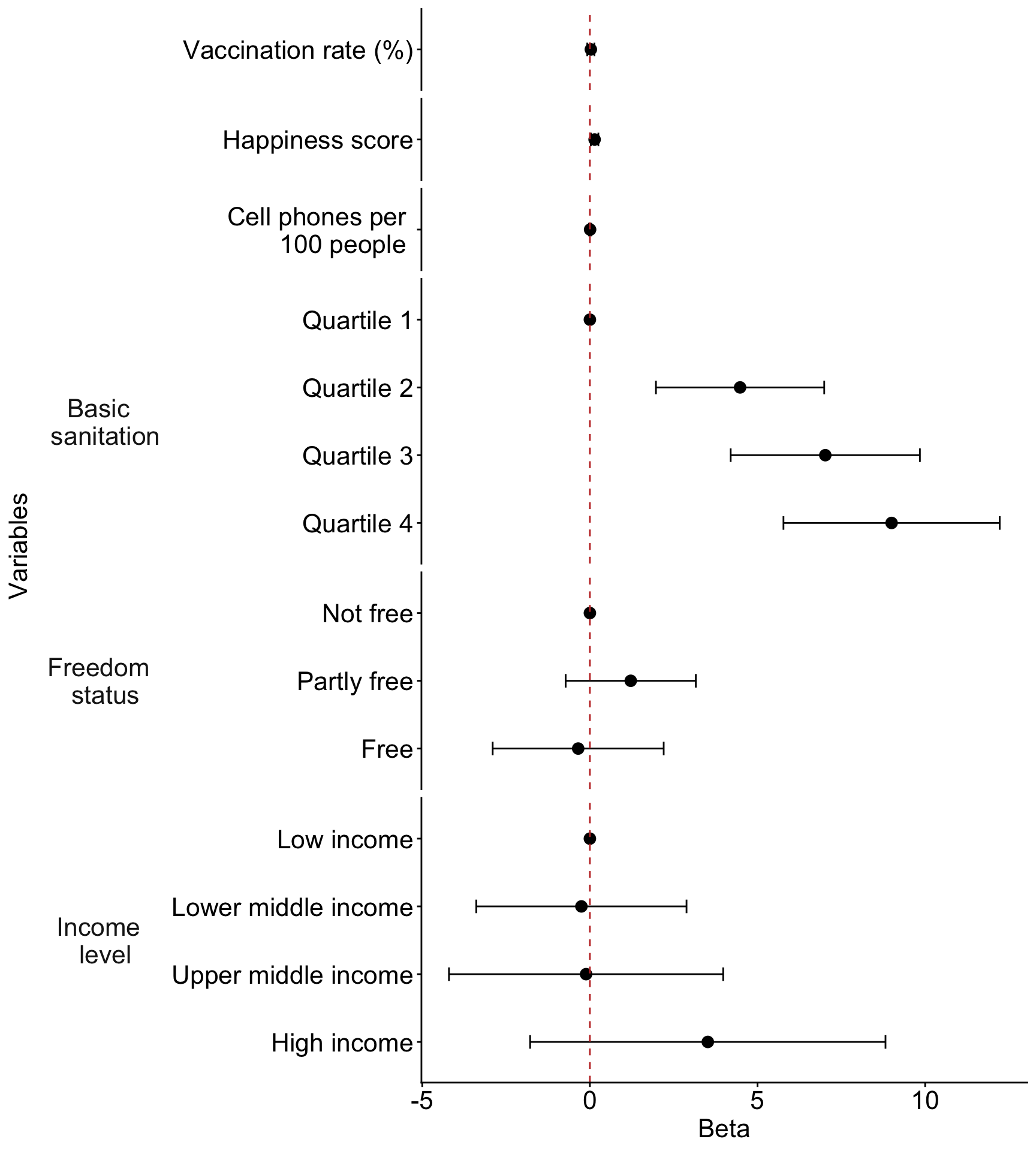
2. Regression table or Forest plot
- This is a fun one to investigate!
- Stick to the regression table if you are having trouble with this!
Code for forest plot
library(broom.helpers)

model_tidy = tidy_and_attach(final_model, conf.int=T) %>%
  tidy_remove_intercept() %>%
  tidy_add_reference_rows() %>% tidy_add_estimate_to_reference_rows() %>%
  tidy_add_term_labels() %>%
  mutate(label = fct_rev(fct_inorder(label))) %>%
  mutate(var_label = case_match(var_label,
                               "BS_q" ~ "Basic sanitation",
                               "freedom_status" ~ "Freedom status",
                               "income_level_4" ~ "Income level",
                               "vax_rate" ~ " ",
                               "happiness_score" ~ "  ",
                               "cell_phones_100" ~ "    ",
                               .default = var_label
                         )) %>%
  mutate(label = case_match(label,
                               "vax_rate" ~ "Vaccination rate (%)",
                               "happiness_score" ~ "Happiness score",
                               "cell_phones_100" ~ "Cell phones per 100 people",
                               .default = label
                         ))

ggplot(data=model_tidy, aes(y=label, x=estimate, xmin=conf.low, xmax=conf.high)) +
  facet_grid(rows = vars(var_label), scales = "free",
             space='free_y', switch = "y") +
  geom_point(size = 3) +  geom_errorbarh(height=.2) +
  geom_vline(xintercept=0, color='#C2352F', linetype='dashed', alpha=1) +
  theme_classic() +
  labs(x = "Beta", y = "Variables") +
  theme(axis.title = element_text(size = 16), axis.text = element_text(size = 16),
        title = element_text(size = 16), strip.placement = "outside",
        strip.text.y.left = element_text(size = 16, angle = 0),
        strip.background = element_blank())