Lesson 8: SLR: Model Diagnostics
2025-02-03
Process of regression data analysis

![]()
![]()
Model Selection
Building a model
Selecting variables
Prediction vs interpretation
Comparing potential models
Model Fitting
Find best fit line
Using OLS in this class
Parameter estimation
Categorical covariates
Interactions
Model Evaluation
- Evaluation of model fit
- Testing model assumptions
- Residuals
- Transformations
- Influential points
- Multicollinearity
Model Use (Inference)
- Inference for coefficients
- Hypothesis testing for coefficients
- Inference for expected \(Y\) given \(X\)
- Prediction of new \(Y\) given \(X\)
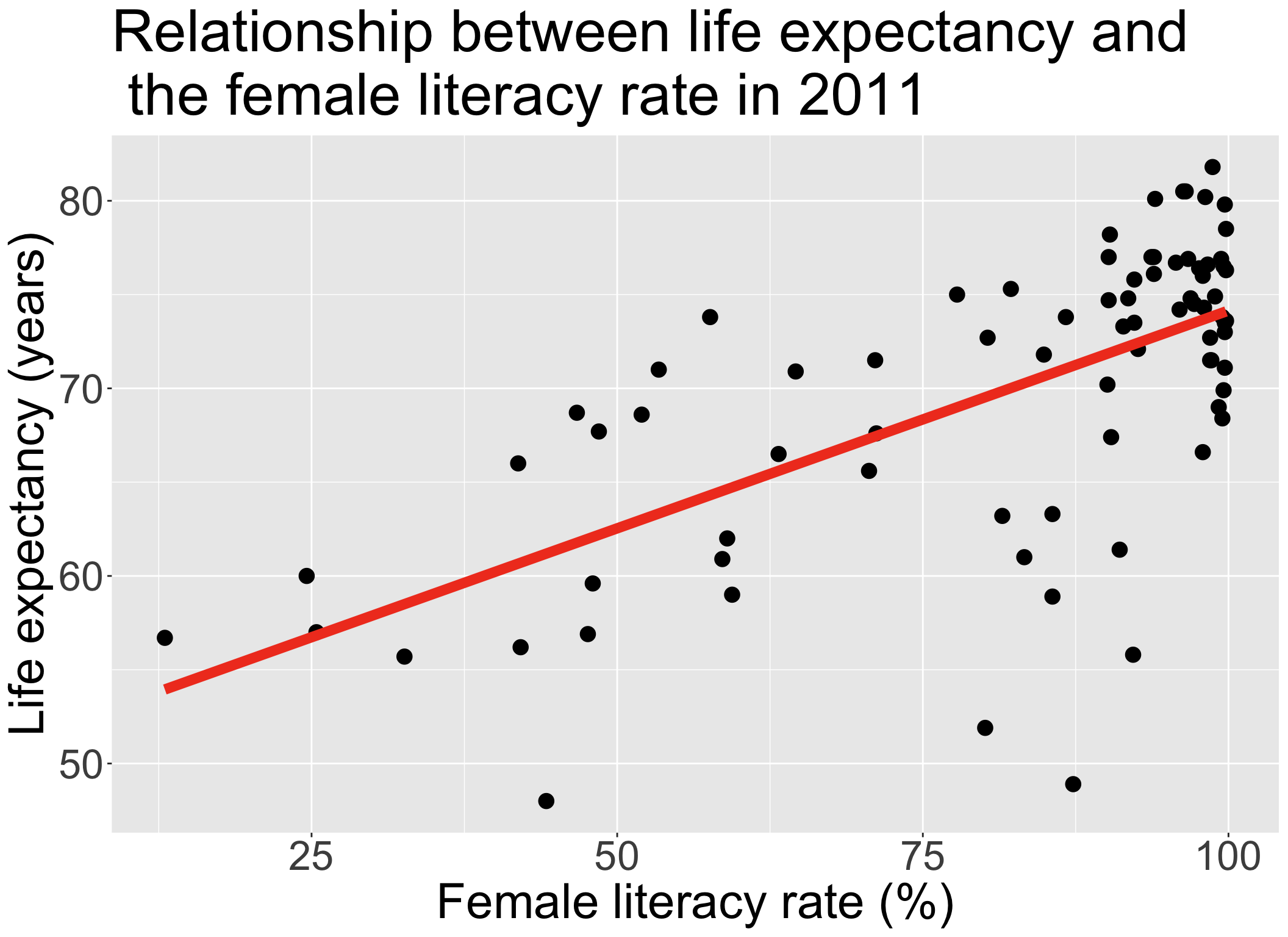
Let’s remind ourselves of the model that we have been working with
We have been looking at the association between life expectancy and female literacy rate
We used OLS to find the coefficient estimates of our best-fit line
\[Y = \beta_0 + \beta_1 X + \epsilon\]
| term | estimate | std.error | statistic | p.value |
|---|---|---|---|---|
| (Intercept) | 50.93 | 2.66 | 19.14 | 0.00 |
| FemaleLiteracyRate | 0.23 | 0.03 | 7.38 | 0.00 |
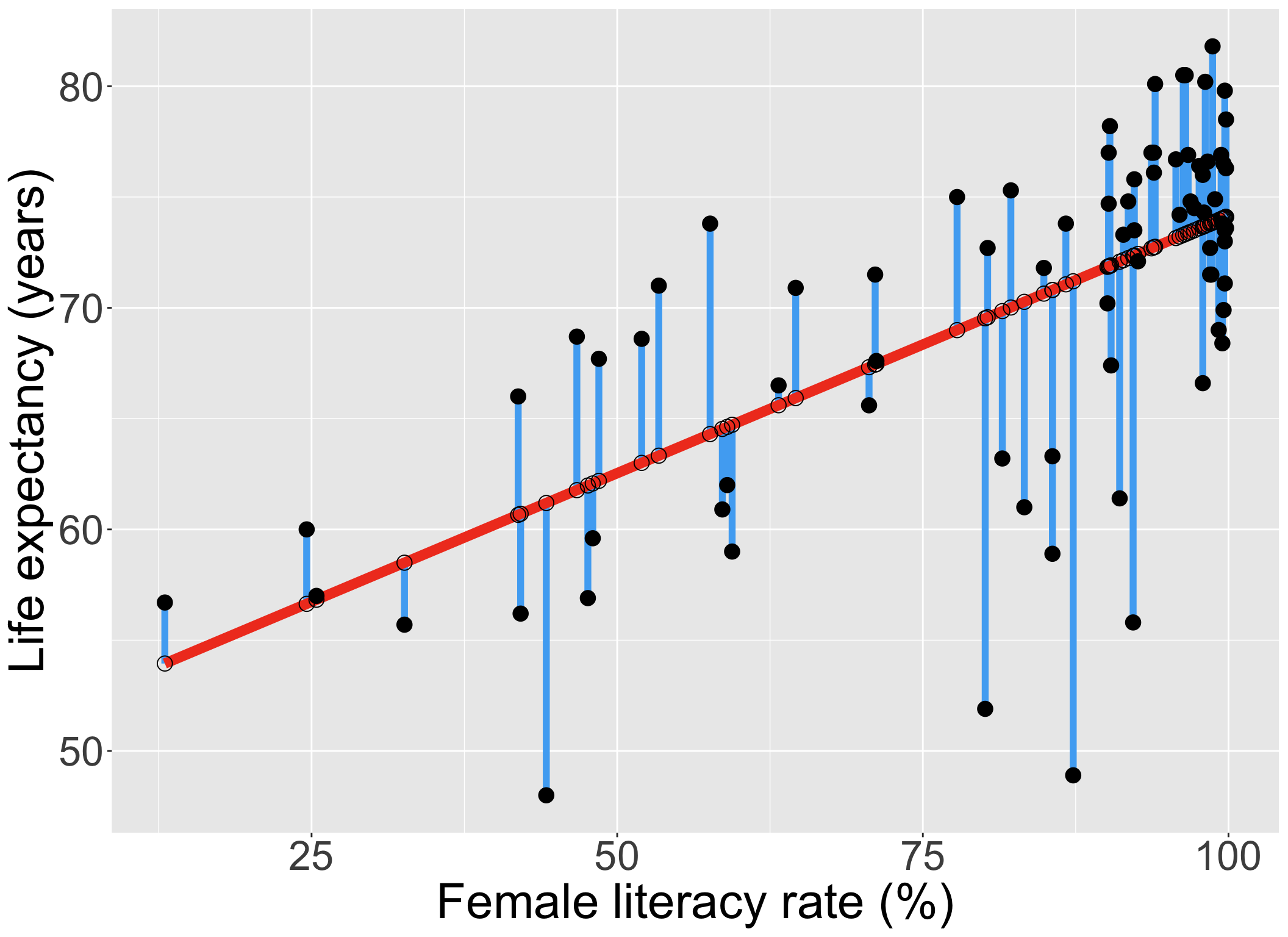
Our residuals will help us a lot in our diagnostics!
The residuals \(\widehat\epsilon_i\) are the vertical distances between
- the observed data \((X_i, Y_i)\)
- the fitted values (regression line) \(\widehat{Y}_i = \widehat\beta_0 + \widehat\beta_1 X_i\)
\[ \widehat\epsilon_i =Y_i - \widehat{Y}_i \text{, for } i=1, 2, ..., n \]
Types of influential points
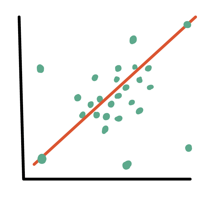
Outliers
- An observation (\(X_i, Y_i\)) whose response \(Y_i\) does not follow the general trend of the rest of the data
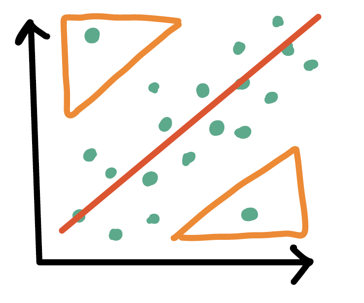
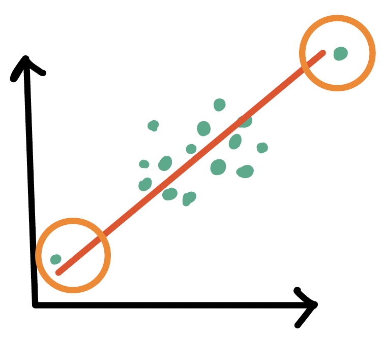
High leverage observations
- An observation (\(X_i, Y_i\)) whose predictor \(X_i\) has an extreme value
- \(X_i\) can be an extremely high or low value compared to the rest of the observations
Outliers
- An observation (\(X_i, Y_i\)) whose response \(Y_i\) does not follow the general trend of the rest of the data
How do we determine if a point is an outlier?
- Scatterplot of \(Y\) vs. \(X\)
- Followed by evaluation of its residual (and standardized residual)
- Typically use the internally standardized residual (aka studentized residual)
Identifying outliers
Internally standardized residual
\[ r_i = \frac{\widehat\epsilon_i}{\sqrt{\widehat\sigma^2(1-h_{ii})}} \]
We flag an observation if the standardized residual is “large”
Different sources will define “large” differently
PennState site uses \(|r_i| > 3\)
autoplot()shows the 3 observations with the highest standardized residualsOther sources use \(|r_i| > 2\), which is a little more conservative
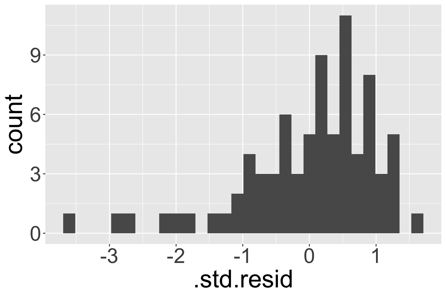
Visual: Countries that are outliers (\(|r_i| > 3\))
Label only countries with large internally standardized residuals:
ggplot(aug1, aes(x = FemaleLiteracyRate, y = LifeExpectancyYrs,
                 label = country)) +
  geom_point() +
  geom_smooth(method = "lm", color = "darkgreen") +
  geom_text(aes(label = ifelse(abs(.std.resid) > 3, as.character(country), ''))) +
  geom_vline(xintercept = mean(aug1$FemaleLiteracyRate), color = "grey") +
  geom_hline(yintercept = mean(aug1$LifeExpectancyYrs), color = "grey")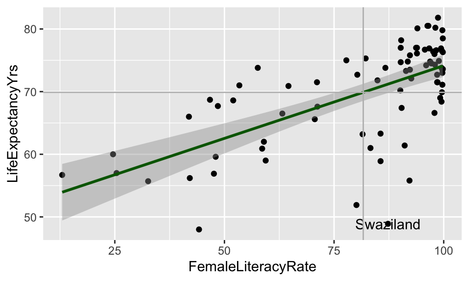
High leverage observations
- An observation (\(X_i, Y_i\)) whose response \(X_i\) is considered “extreme” compared to the other values of \(X\)
How do we determine if a point has high leverage?
- Scatterplot of \(Y\) vs. \(X\)
- Calculating the leverage of each observation
Visual: Countries with high leverage (\(h_i > 4/n\))
Label only countries with large leverage:
ggplot(aug1, aes(x = FemaleLiteracyRate, y = LifeExpectancyYrs,
                 label = country)) +
  geom_point() +
  geom_smooth(method = "lm", color = "darkgreen") +
  geom_text(aes(label = ifelse(.hat > 4/80, as.character(country), ''))) +
  geom_vline(xintercept = mean(aug1$FemaleLiteracyRate), color = "grey") +
  geom_hline(yintercept = mean(aug1$LifeExpectancyYrs), color = "grey")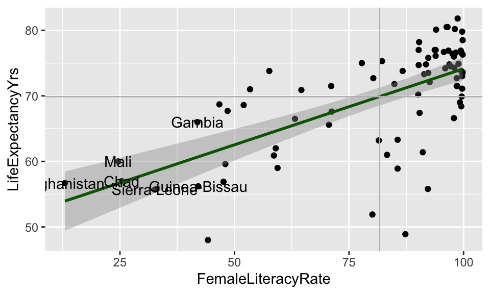
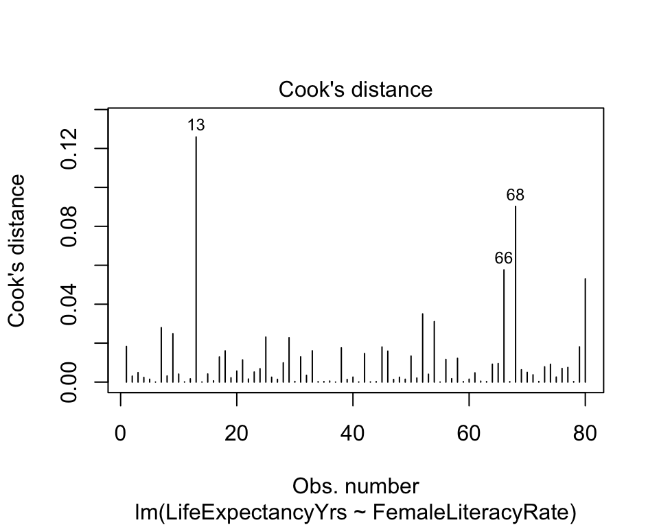
Plotting Cook’s Distance
plot(model)shows figures similar toautoplot()- 4th plot is Cook’s distance (not available in
autoplot())
- 4th plot is Cook’s distance (not available in
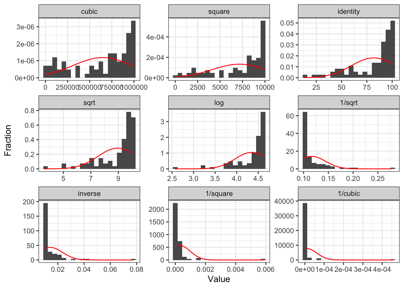
Transform independent variable?
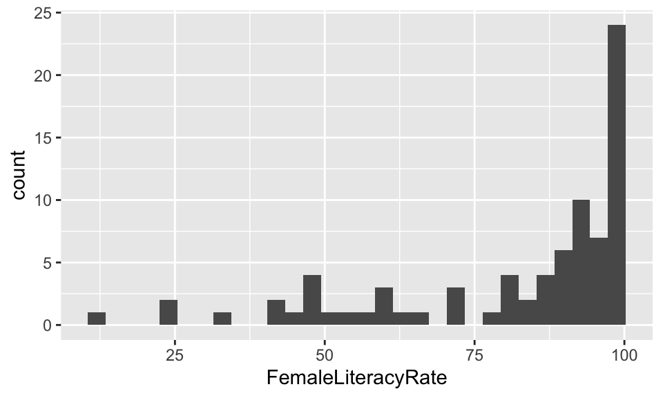
gladder() of female literacy rate
Transform dependent variable?
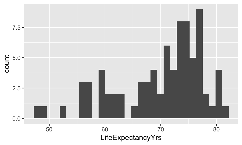
gladder() of life expectancy
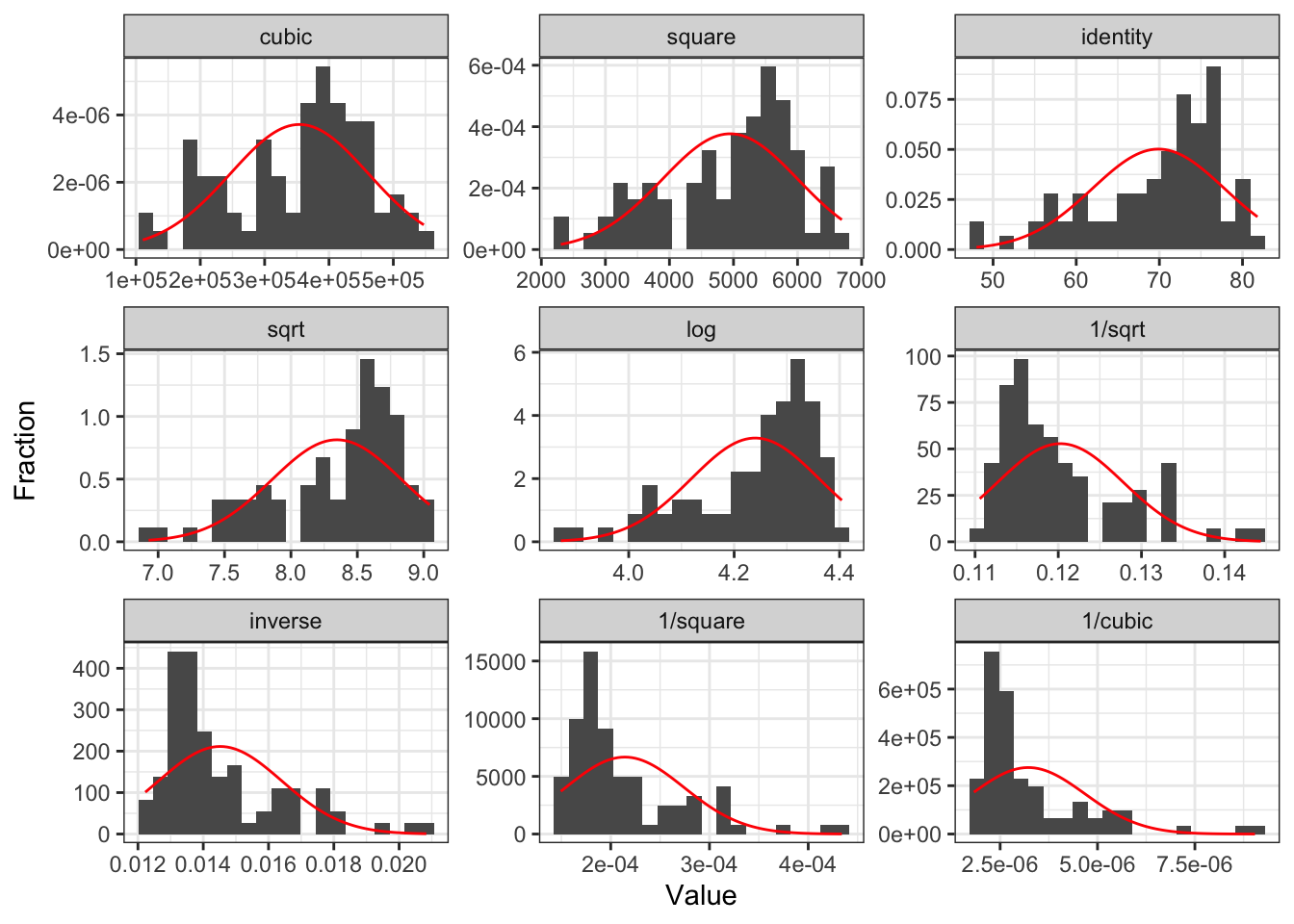
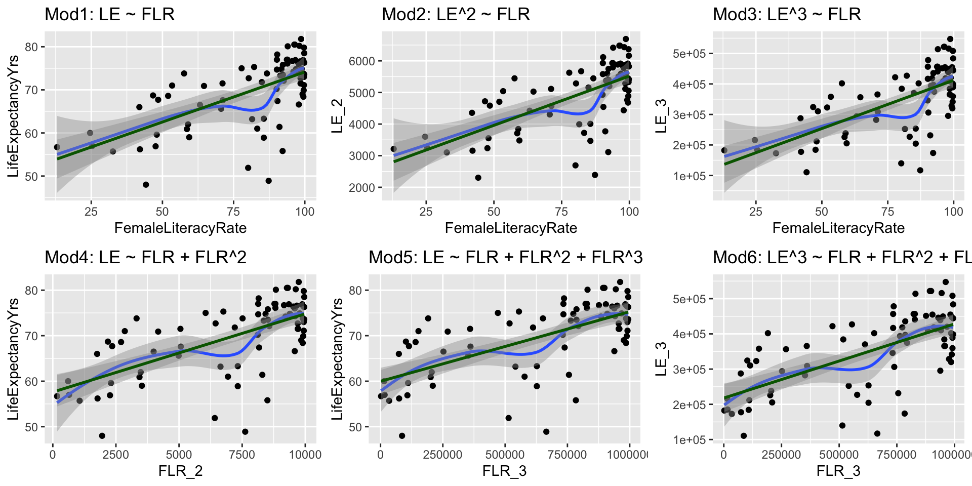
Compare Scatterplots: does linearity improve?
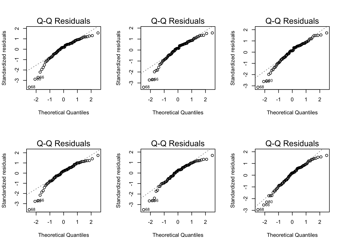
Normal Q-Q plots comparison
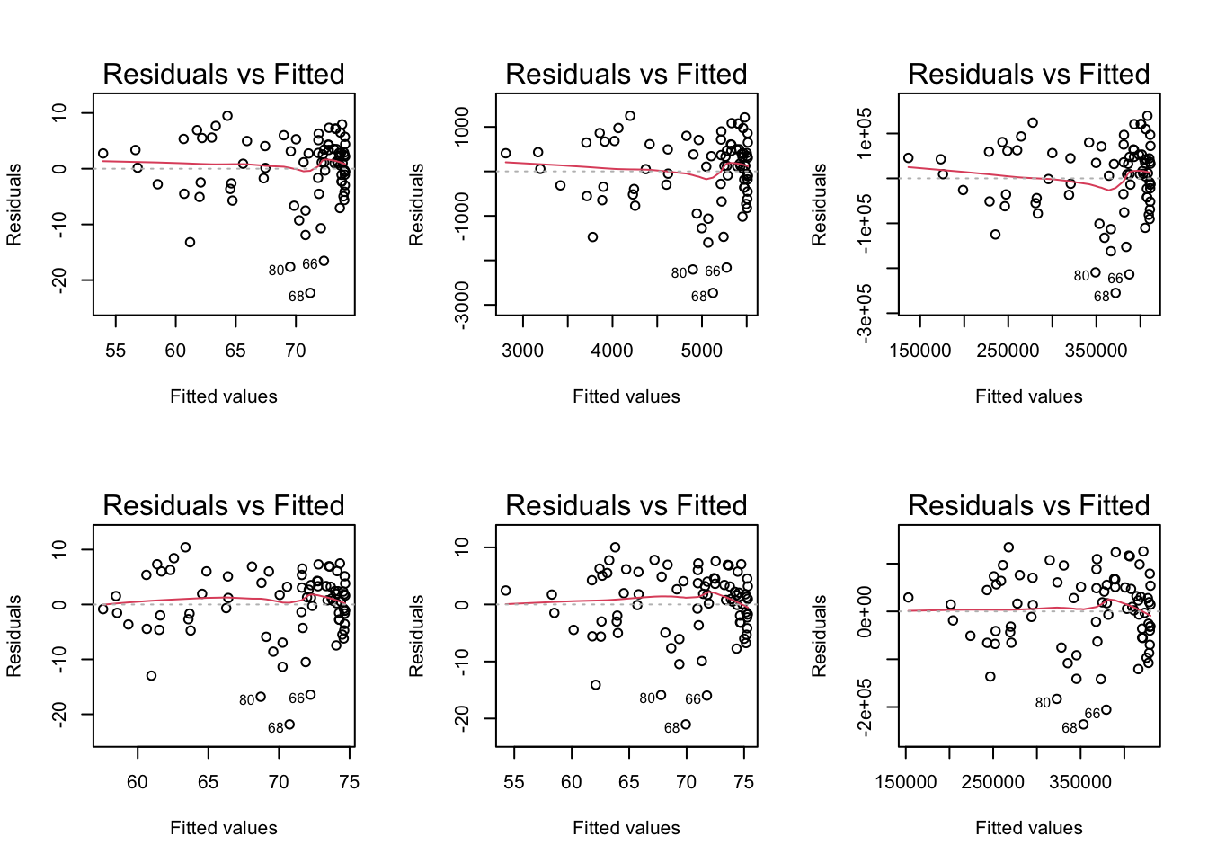
Residual plots comparison