Poster Results Help Session

Nicky Wakim

2025-03-05

Some lab 3 notes

  • Internalization variable only has 5 groups!
    • 1 “Not at all” 2 “Slightly” 3 “Moderately” 4 “Very” 5 “Extremely”
  • Do NOT combine gender indicators back into one variable
    • Need to keep them as separate variables
    • This is bc the indicators are not mutually exclusive - someone can identify as multiple genders
  • Limit your decimal places on regression table outputs!!
  • Please remove unnecessary color in your plots
    • If the information can be easily conveyed with text, use text!
    • If color gives redundant info, do not use!

Some notes

  • I will NOT be counting exact bullet points
    • If it says 2-3, anything less than 4 is okay
    • If it says 5-6, it shouldn’t be 1 and it shouldn’t be >10
  • Do NOT make bullet points really long!
  • I tried the QMD poster, and it is REALLY hard to troubleshoot
    • I highly suggest making your poster in powerpoint!

Background

  • Length: 5-8 bullets
  • Purpose: Introduce the research question and why it is important to study
  • This section is non-technical.
    • By reading just the introduction and conclusion, someone without a technical background should have an idea of what they study was about, why it is important, and what the main results are
  • You may start with your bullets from Lab 1, but you should edit it and make sure it flows into your report well!
  • Should contain some references

Methods

  • Length: 8-10 bullets
  • Purpose: Describe the analyses that were conducted and methods used to select variables and check diagnostics
  • Some important methods to discuss (You may divide these into your sections, not necessarily with these names)
    • General approach to the dataset
    • Variables and variable creation
    • Model building: we performed purposeful selection
    • Final model
    • Model diagnostics

Methods for life expectancy

  • Data were collected from Gapminder and World Bank with 197 countries in 2011
  • We performed a complete case analysis on 72 countries
  • We generated categorized variables for CO2 emissions and income levels
    • CO2 emissions used quartiles
    • Income levels used the specified groupings by Gapminder
  • We used purposeful model selection, a combination of field expertise and statistical methods, to determine the final model
  • We performed linear regression on our outcome, life expectancy, with a main effect for female literacy rate while adjusting for confounders \[\widehat{\text{LE}} = \widehat{\beta}_0 + \widehat{\beta}_1 \text{FLR} + \text{other confounders}\]
    • We adjusted for: CO2 emissions, income levels, world region, access to improved water, food supply, and intergovernmental groups
  • We investigated model assumptions and diagnostics using standardized residuals, leverage, Cook’s distance, and variance inflation factors (VIFs)
  • We used R version 4.4.1 to analyze data

Results: What should be in your results?

  1. Table 1 (table summary in Lesson 2)

  2. Regression table or Forest plot

  3. One additional figure or table to help understand your question

  4. Interpretations of important coefficient estimates

1. Table 1 (table summary in Lesson 2)

library(gtsummary)

gapm2_vars = gapm2 %>% 
  select(
    CO2emissions, 
    FoodSupplykcPPD, 
    FemaleLiteracyRate, 
    WaterSourcePrct, 
    four_regions, 
    members_oecd_g77, 
    income_levels1
  )

tbl_summary(
  gapm2_vars, 
  label = list(
    FemaleLiteracyRate = "Female literacy rate (%)", 
    CO2emissions = "CO2 emissions quartiles", 
    income_levels1 = "Income levels", 
    four_regions = "World region",
    WaterSourcePrct = "Access to improved water (%)",
    FoodSupplykcPPD = "Food supply (kcal PPD)",
    members_oecd_g77 = "Intergovernmental group"
    ),
  statistic = list(all_continuous() ~ "{mean} ({sd})")
  )
Characteristic N = 721
CO2 emissions quartiles 4.1 (5.6)
Food supply (kcal PPD) 2,812 (407)
Female literacy rate (%) 82 (23)
Access to improved water (%) 86 (16)
World region
    Africa 20 (28%)
    Americas 12 (17%)
    Asia 17 (24%)
    Europe 23 (32%)
Intergovernmental group
    Group of 77 47 (65%)
    OECD 7 (9.7%)
    Others 18 (25%)
Income levels
    Low income 10 (14%)
    Lower middle income 24 (33%)
    Upper middle income 24 (33%)
    High income 14 (19%)
1 Mean (SD); n (%)

2. Regression table or Forest plot

tbl_regression(
  final_model, 
  label = list(
    FemaleLiteracyRate ~ "Female literacy rate (%)", 
    CO2_q ~ "CO2 emissions quartiles", 
    income_levels1 ~ "Income levels", 
    four_regions ~ "World region",
    WaterSourcePrct ~ "Access to improved water (%)",
    FoodSupplykcPPD ~ "Food supply (kcal PPD)",
    members_oecd_g77 ~ "Intergovernmental group"
    )) %>%   
  as_gt() %>% 
  tab_options(table.font.size = 20) %>%
  cols_width(label ~ px(250))
Characteristic Beta 95% CI1 p-value
Female literacy rate (%) -0.07 -0.17, 0.02 0.13
CO2 emissions quartiles


    Quartile 1
    Quartile 2 1.1 -2.7, 4.9 0.6
    Quartile 3 -0.29 -5.1, 4.6 >0.9
    Quartile 4 -0.60 -5.6, 4.5 0.8
Income levels


    Low income
    Lower middle income 5.4 0.75, 10 0.024
    Upper middle income 6.1 0.20, 12 0.043
    High income 8.0 1.4, 15 0.018
World region


    Africa
    Americas 9.0 4.9, 13 <0.001
    Asia 5.3 2.0, 8.5 0.002
    Europe 6.9 1.1, 13 0.020
Access to improved water (%) 0.17 0.03, 0.30 0.015
Food supply (kcal PPD) 0.00 0.00, 0.01 0.073
Intergovernmental group


    Group of 77
    OECD 1.1 -4.2, 6.5 0.7
    Others 1.0 -4.0, 6.1 0.7
1 CI = Confidence Interval

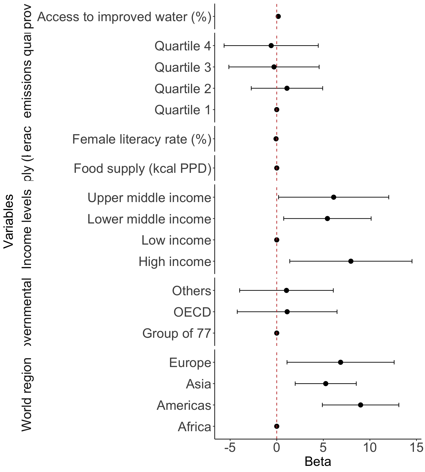
2. Regression table or Forest plot (needs work!)

  • This is a fun one to investigate!
  • Stick to the regression table if you are having trouble with this!
library(broom.helpers)

model_tidy = tidy_and_attach(final_model, conf.int=T) %>%
  tidy_remove_intercept() %>%
  tidy_add_reference_rows() %>% tidy_add_estimate_to_reference_rows() %>%
  tidy_add_term_labels()

ggplot(data=model_tidy, aes(y=label, x=estimate, xmin=conf.low, xmax=conf.high)) + 
  facet_grid(rows = vars(var_label), scales = "free",
             space='free_y', switch = "y") + 
  geom_point(size = 3) +  geom_errorbarh(height=.2) + 
  geom_vline(xintercept=0, color='#C2352F', linetype='dashed', alpha=1) +
  theme_classic() +
  labs(x = "Beta", y = "Variables") +
  theme(axis.title = element_text(size = 20), axis.text = element_text(size = 20), 
        title = element_text(size = 20), strip.placement = "outside", 
        strip.text = element_text(size = 20), strip.background = element_blank())

Important note if you have interactions

  • There is extra care to reporting results from interactions

  • Please make sure you use estimable() to get the correct effects!

    • If you have an interaction with a categorical variable, then your main variable’s “effect” should be reported for each category