
Lesson 7: Data visualization of a single variable
2024-10-21
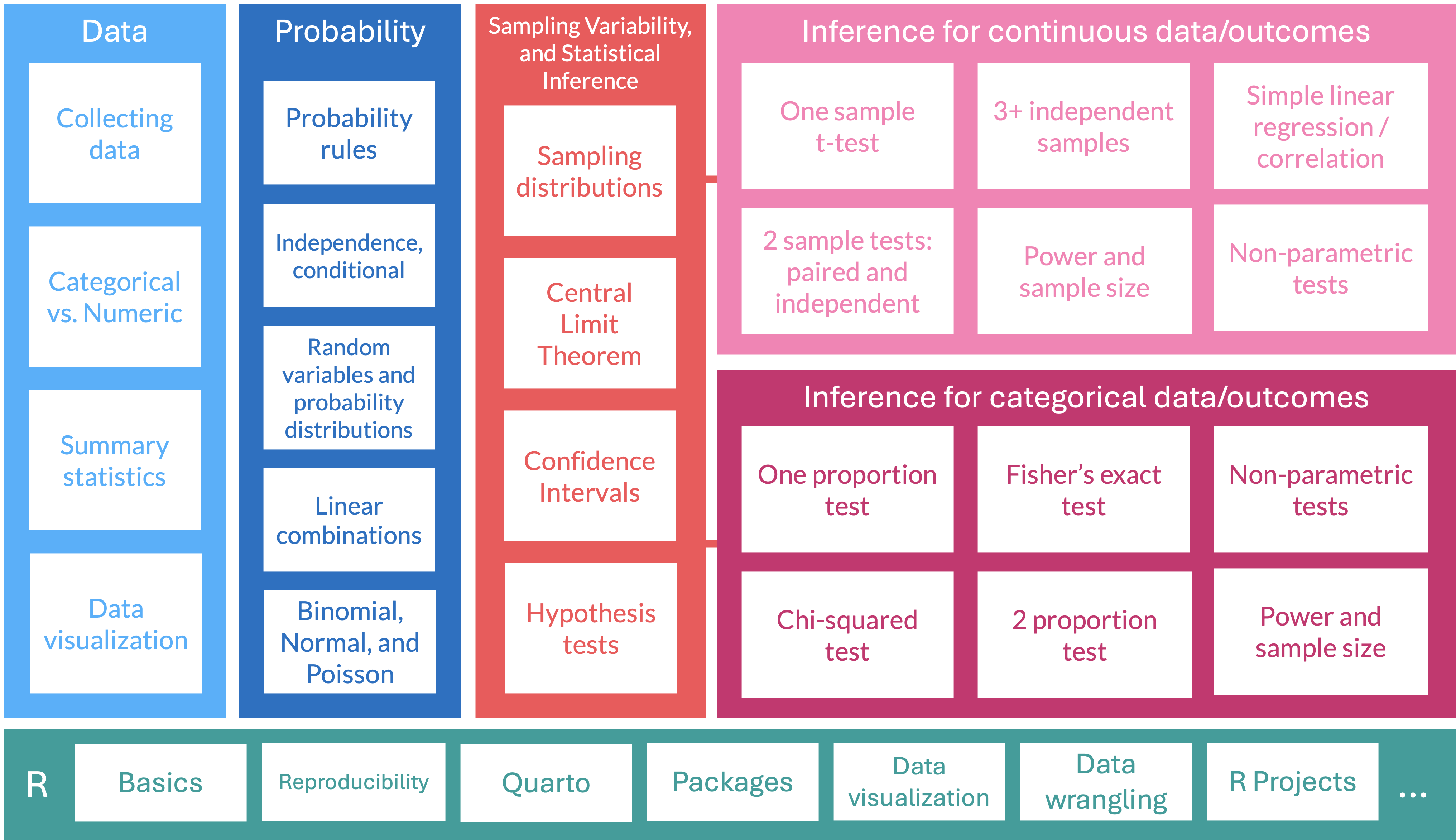
Where are we?
Artwork by @allison_horst
Histograms
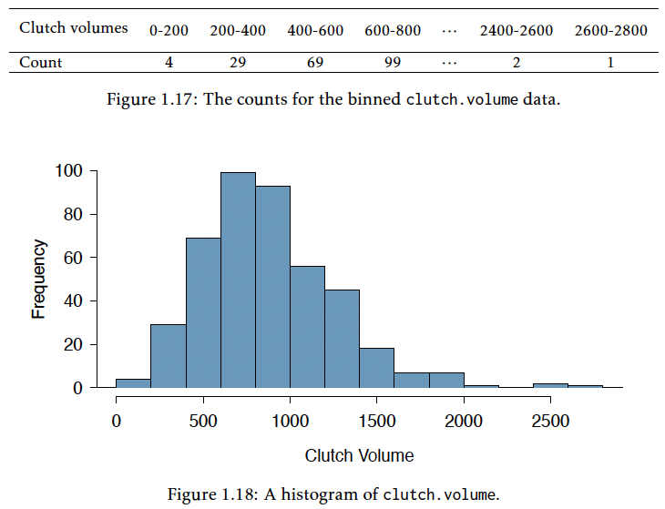
- Histograms show the counts of observations (y-axis) that have values within a specific interval for a specific variable (x-axis)
- Show the shape of the distribution and data density
- Distribution is considered symmetric if the trailing parts of the plot are roughly equal
- Distribution is considered asymmetric if one tail trails off more than the other (as we see with clutch volume)
- Asymmetric distributions are said to be skewed
- Skewed right if trails off to right
- Skewed left if trails off to the left
Histograms
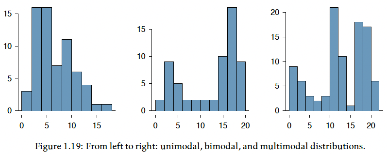
- Mode is represented by the tallest peak in the distribution
- When data have one prominent peak, we call it unimodel
- If there is more than one relative peak, we call it multimodel
Histograms
We can make a histogram of clutch volume or clutch size:

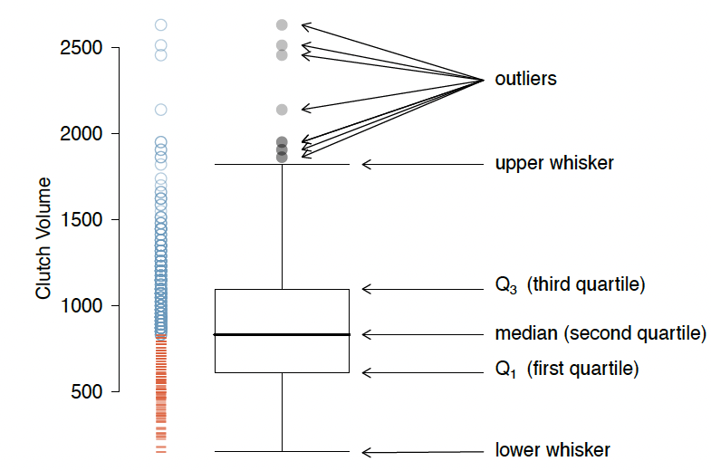
Boxplots
- A boxplot indicates the positions of the first, second, and third quartiles of a distribution in addition to extreme observations
- Interquartile range (IQR) represented by rectangle with black line through it for the median
- Whiskers extend from the box to capture data that are between \(Q_1\) and \(Q_1 - 1.5 IQR\) and separately between \(Q_3\) and \(Q_3 + 1.5 IQR\)
- An outlier is a value that appears extreme relative to the rest of the data
- It is more than \(1.5IQR\) away from \(Q_1\) and \(Q_3\)
Boxplots


Let’s transform clutch volume!


Barplots
- A bar plot is a common way to display a single categorical variable
- Show counts (or proportion) per category for a variable

