Lesson 8: Data visualization of two variables
2024-10-23
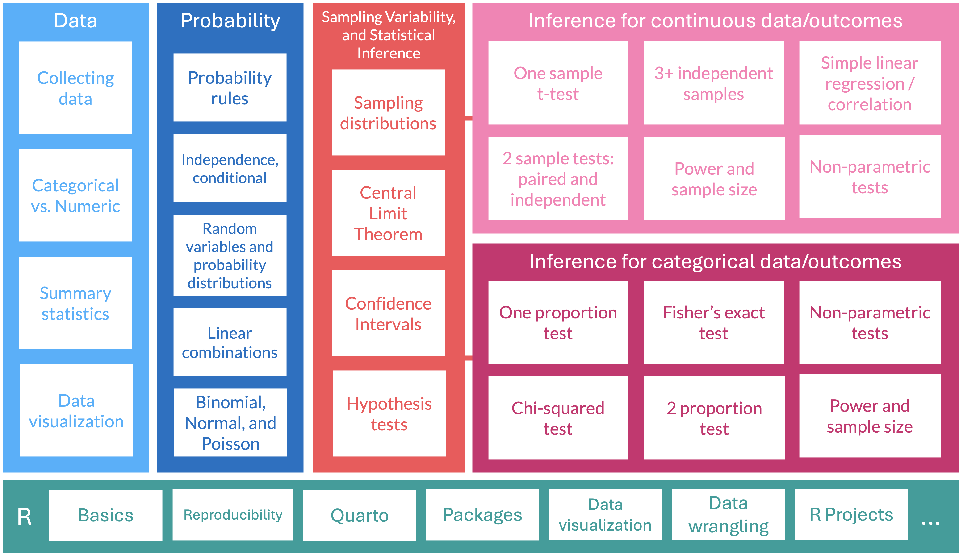
Where are we?
Scatterplots
- Scatterplots provide case-by-case view of the relationship between two numerical variables
- We can make a scatterplot of clutch volume vs. body size, with clutch volume on the y-axis and body size on the x-axis
- Each point represents an observation (egg clutch) with its measurement for clutch volumn and body size of parent

Describing associations between 2 numerical variables
Two variables \(x\) and \(y\) are
Positively associated if \(y\) increases as \(x\) increases
Negatively associated if \(y\) decreases as \(x\) increases
- If there is no association between the variables, then we say they are uncorrelated or independent
The term “association” is a very general term
- Can be used for numerical or categorical variables
- Not specifically referring to linear associations
Female body size and clutch volume are positively associated with each other
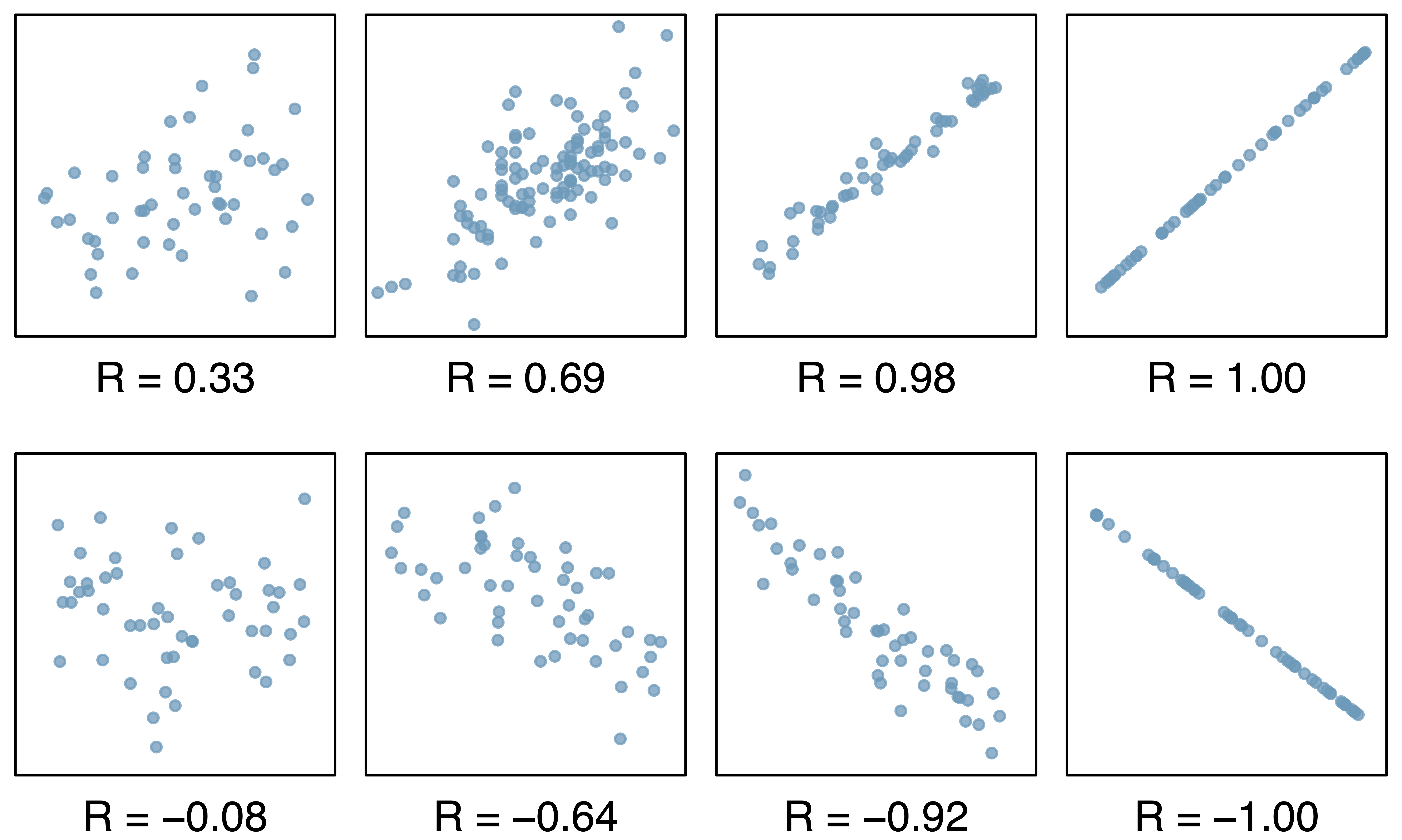
(Pearson) Correlation coefficient (\(r\))
- \(r = -1\) indicates a perfect negative linear relationship: As one variable increases, the value of the other variable tends to go down, following a straight line
- \(r = 0\) indicates no linear relationship: The values of both variables go up/down independently of each other
- \(r = 1\) indicates a perfect positive linear relationship: As the value of one variable goes up, the value of the other variable tends to go up as well in a linear fashion
- The closer \(r\) is to ±1, the stronger the linear association
Guess the correlation game!
Rossman & Chance’s applet
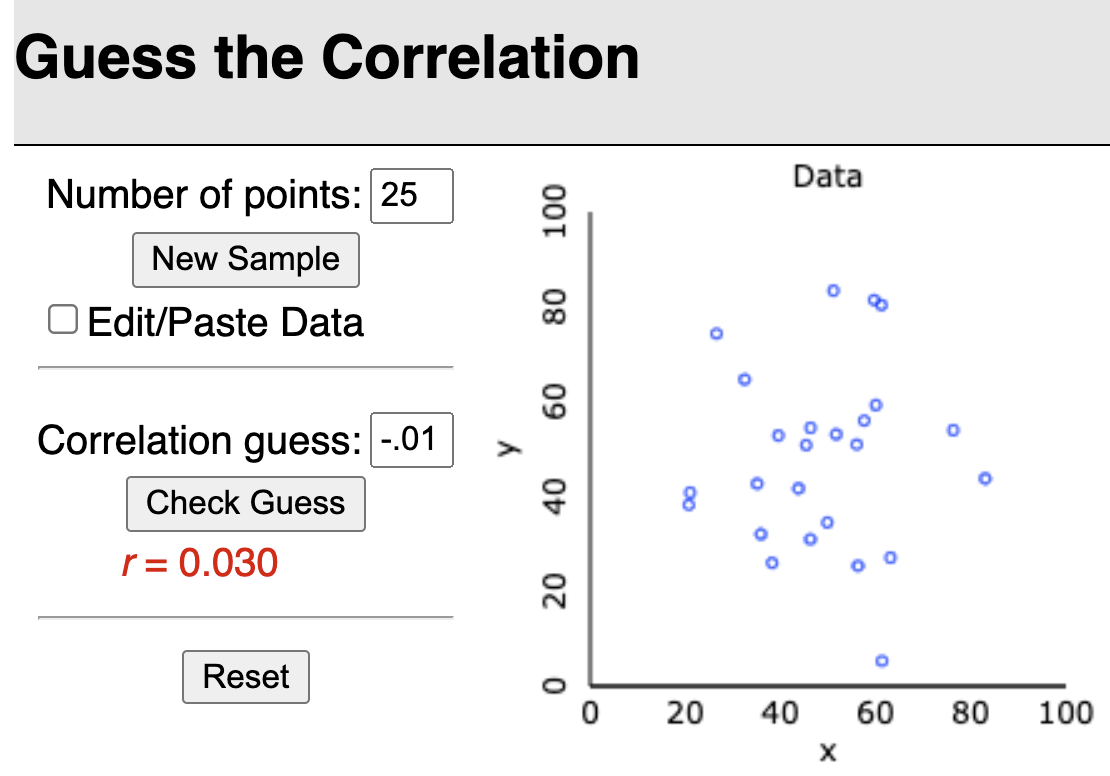
Tracks performance of guess vs. actual, error vs. actual, and error vs. trial
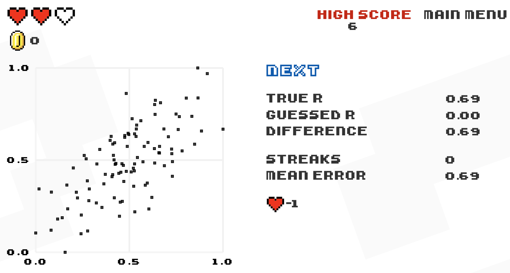
Or, for the Atari-like experience
Last time: Barplots
Counts (below) vs. percentages (right)


Barplots with 2 variables: segmented bar plots
- Way of visualizing the information from a contingency table


Barplots with 2 variables: side-by-side bar plots

Side-by-side boxplots
- We can look at the boxplot of percent change for each genotype

Side-by-side boxplots with data points
- We can look at the boxplot of percent change for each genotype with points shown so we can see the distribution of observations better

Density plots by group
- Allows us to see the densities of percent change for each genotype

Ridgeline plot
- Overlapped densities were easy enough to see with 3 genotypes
- If you have many categories, a ridgeline plot might make it easier to see
