new_dataset <- old_datasetMuddy Points
Lesson 14: Hypothesis testing part 03
Fall 2025
1. How to rename datasets in R (is it just name2 = name1 or do you need to use a specific function/package?)
Yes, you can simply rename a dataset in R by assigning it to a new variable name using the assignment operator <- or =.
For example:
or
new_dataset = old_datasetThis creates a new variable new_dataset that contains the same data as old_dataset.
2. Understanding how the means of the two samples fall on one distributive curve (still a bit confused)
The confusion about how two sample means fall on one curve is resolved by understanding that the “one curve” isn’t about the individual sample means (\(\bar{X}_1\) and \(\bar{X}_2\)), but about the difference between them (\(\bar{X}_1 - \bar{X}_2\)).
The single distribution you are looking for is the Sampling Distribution of the Difference in Sample Means.
The distribution of \(\bar{X}_1 - \bar{X}_2\) is a Normal distribution with:
- Mean: \(E[\overline{X}_1 - \overline{X}_2] = \mu_1 - \mu_2\)
- Standard Deviation (Standard Error): \(SD(\overline{X}_1 - \overline{X}_2) = \sqrt{\frac{\sigma_1^2}{n_1}+\frac{\sigma_2^2}{n_2}}\)
\[\overline{X}_1 - \overline{X}_2 \sim \text{Normal} \left( \mu_1 - \mu_2, \sqrt{\frac{\sigma_1^2}{n_1} + \frac{\sigma_2^2}{n_2}} \right)\]
Let’s look at the distributions
We’ll use R and ggplot2 to simulate two hypothetical populations and show the three key distributions.
1. R Setup and Parameters
We define the true population means (\(\mu\)) and standard deviations (\(\sigma\)) and a sample size (\(n\)).
2. Visualize the Individual Sample Mean Distributions.
This plot shows the two separate sampling distributions for \(\overline{X}_A\) and \(\overline{X}_B\).
Code
# Data for the individual sampling distributions (for plot limits)
data_sd_A <- data.frame(mean_A = c(mu_A - 3*sigma_A/sqrt(n_A), mu_A + 3*sigma_A/sqrt(n_A)))
data_sd_B <- data.frame(mean_B = c(mu_B - 3*sigma_B/sqrt(n_B), mu_B + 3*sigma_B/sqrt(n_B)))

# --- Individual Sample Mean Distributions Plot ---
ggplot(data.frame(x = c(95, 110)), aes(x)) +
  # Distribution A (Centered at mu_A = 100)
  stat_function(fun = dnorm, args = list(mean = mu_A, sd = sigma_A / sqrt(n_A)),
                geom = "area", fill = "blue", alpha = 0.4) +
  # Distribution B (Centered at mu_B = 105)
  stat_function(fun = dnorm, args = list(mean = mu_B, sd = sigma_B / sqrt(n_B)),
                geom = "area", fill = "red", alpha = 0.4) +
  labs(title = "Distributions of Individual Sample Means",
       subtitle = expression(paste(bar(X)[A], " (Blue) and ", bar(X)[B], " (Red)")),
       x = "Sample Mean Value", y = "Density") +
  theme_minimal()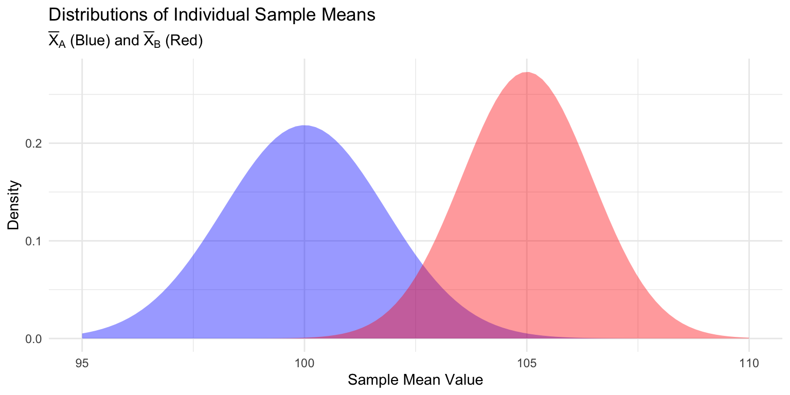
3. Take One Pair of Random Samples
We simulate the result of one experiment by taking one pair of samples.
# Take one random sample from each hypothetical population
sample_A <- rnorm(n = n_A, mean = mu_A, sd = sigma_A)
sample_B <- rnorm(n = n_B, mean = mu_B, sd = sigma_B)

# Calculate the single observed sample means and their difference
x_bar_A <- mean(sample_A)
x_bar_B <- mean(sample_B)
observed_diff <- x_bar_A - x_bar_B- One Observed Sample Mean A (
x_bar_A): 100.69 - One Observed Sample Mean B (
x_bar_B): 104.02 - Observed Difference (
x_bar_A-x_bar_B): -3.34
4. Visualize the Sampling Distribution of the Difference
This is the single curve where the observed difference from our samples falls. It’s centered at the true difference in population means (\(\mu_A - \mu_B = -5\))
Code
# --- Sampling Distribution of the DIFFERENCE Plot ---
max_density <- dnorm(true_diff_mean, true_diff_mean, sd_diff_mean)

ggplot(data.frame(x = c(true_diff_mean - 4*sd_diff_mean, true_diff_mean + 4*sd_diff_mean)), aes(x)) +
  # The Distribution of the DIFFERENCE (The "One Curve")
  stat_function(fun = dnorm, args = list(mean = true_diff_mean, sd = sd_diff_mean),
                geom = "area", fill = "purple", alpha = 0.6) +

  # Line for the True Difference (Center of the distribution)
  geom_vline(xintercept = true_diff_mean, color = "black", linetype = "dashed", size = 1) +

  # Line for the ONE Observed Difference from our samples
  geom_vline(xintercept = observed_diff, color = "darkgreen", size = 1.2) +

  labs(title = "The Sampling Distribution of the DIFFERENCE in Means",
       subtitle = "The 'One Curve' for the Difference in Sample Means",
       # SIMPLIFIED X-AXIS LABEL (This is the stable fix)
       x = "Difference in Sample Means (Xbar_A - Xbar_B)",
       y = "Density") +

  # Text for True Difference
  geom_text(aes(x = true_diff_mean, y = max_density * 0.95),
            label = "True Difference: -5",
            hjust = 1.1, size = 4) +

  # Text for Observed Difference
  geom_text(aes(x = observed_diff, y = max_density * 0.85),
            label = paste("Observed Difference:", round(observed_diff, 2)),
            hjust = -0.1, size = 4, color = "darkgreen") +

  theme_minimal()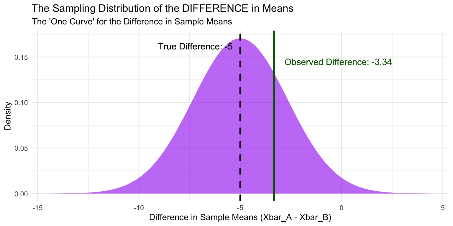
The Takeaway
The final graph demonstrates the core concept:
- We collect two samples and calculate their means, \(\bar{X}_A\) and \(\bar{X}_B\).
- We compute the single value of the observed difference: \(\bar{X}_A - \bar{X}_B\) (the dark green line).
- This single value is positioned on the single distribution (the purple curve), which represents the likelihood of obtaining any possible difference, assuming the true difference is \(\mu_A - \mu_B\) (the dashed black line).