Data visualization: Basic plotting

Nicky Wakim

Recall: Grammar of ggplot2

  • We typically start at the bottom (data) and work our way up (themes)
    • You skip some of the layers if you don’t need them


  • ggplot2 needs at least the following three to produce a chart:
    • data, a mapping, and a layer


  • For the most part, there are default settings for the other parts:
    • scales, facets, coordinates, and themes

Recall: common components of ggplot2

  • Common components of ggplot2 include:
    • ggplot(): the main function to create a plot
    • aes(): the function to specify the mapping of variables to axes
    • geom_*() or stat_*(): functions to add layers to the plot
    • labs(): the function to change labels of axes and title
    • theme(): the function to adjust non-data plot elements such as text size,


ggplot(
  data = my_data, 
  mapping = aes(x = col1, y = col2)
  ) +
  
  geom_*() +          
  
  labs() +       
  
  theme()                                  

In this lesson, we will focus on using different geometric objects and building the mapping.

Geometric objects

  • Geometric objects (geom’s) are used to represent the datapoints (aka observations)
    • The same variable’s data can be represented in different ways

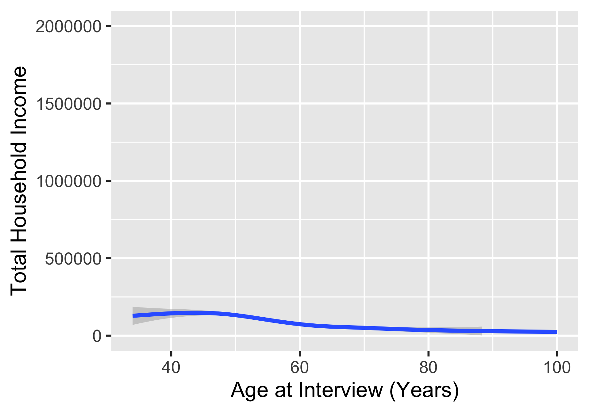
For example: we can plot Age vs. Income using a scatterplot or a smoothed line
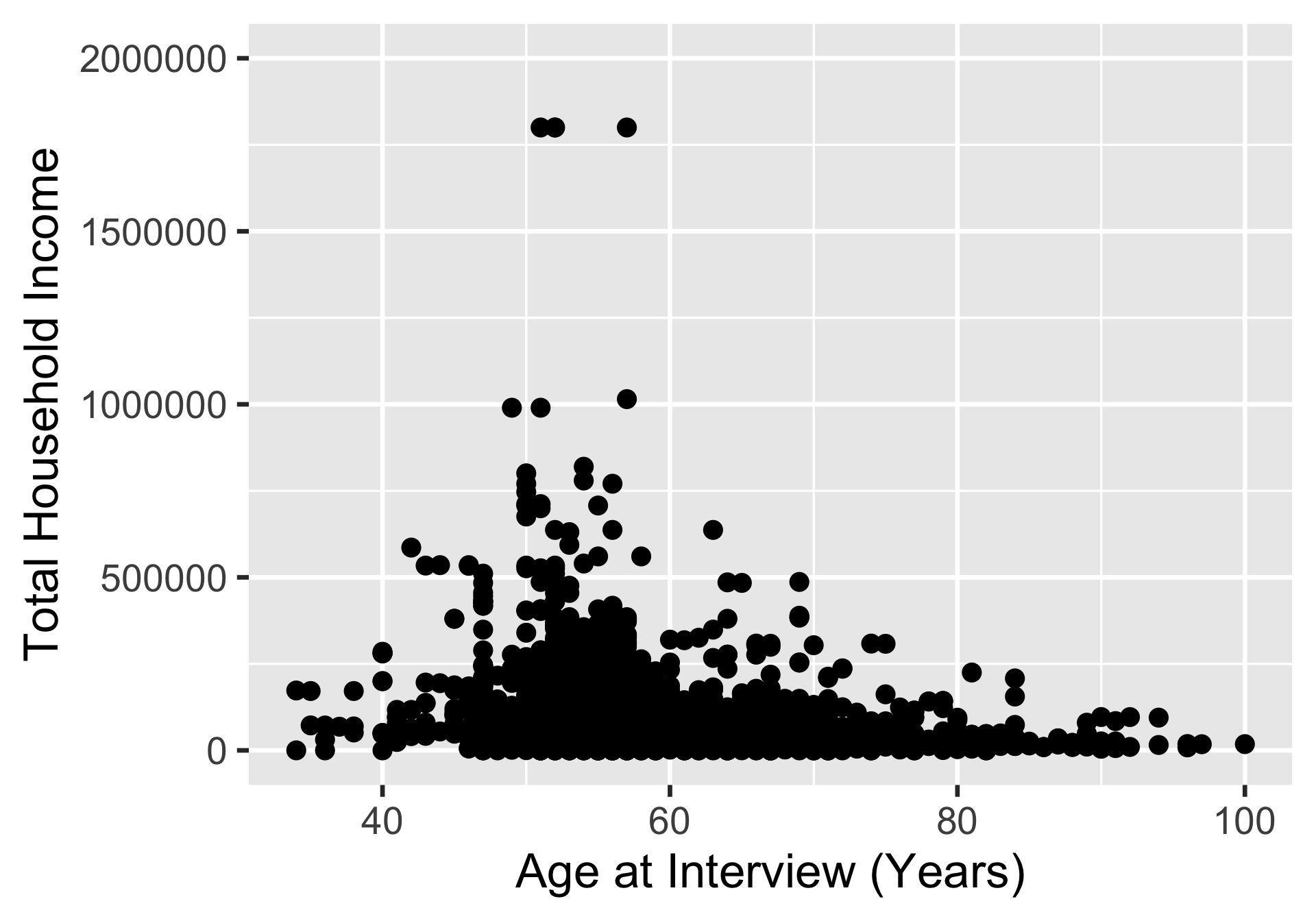
Scatterplot of Age vs. Income
ggplot(
  hrs_data, 
  mapping = aes(
    x = age_yr, 
    y = income
    )
  ) + 
  geom_point() +
  ylim(0, 2000000)

Line plot of Age vs. Income
ggplot(
  hrs_data, 
  mapping = aes(
    x = age_yr, 
    y = income
    )
  ) + 
  geom_smooth() +
  ylim(0, 2000000)

Types of geoms

Common geom_*() for plots with one variable:

  • geom_histogram() (for numeric)
  • geom_bar() (for categorical)
  • geom_boxplot()
  • geom_density()
  • geom_dotplot()

Common geom_*() for plots with two or more variables:

  • geom_point()
  • geom_line()
  • geom_boxplot()
  • geom_smooth()
  • geom_jitter()

Example 1: One continuous variable (1/2)
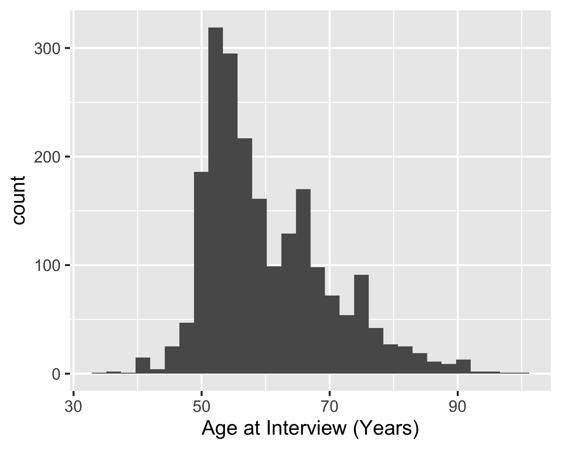
ggplot(hrs_00) +
  geom_histogram(aes(x = age_yr))
1
The geom_histogram() function is used to create a histogram of the age_yr variable.

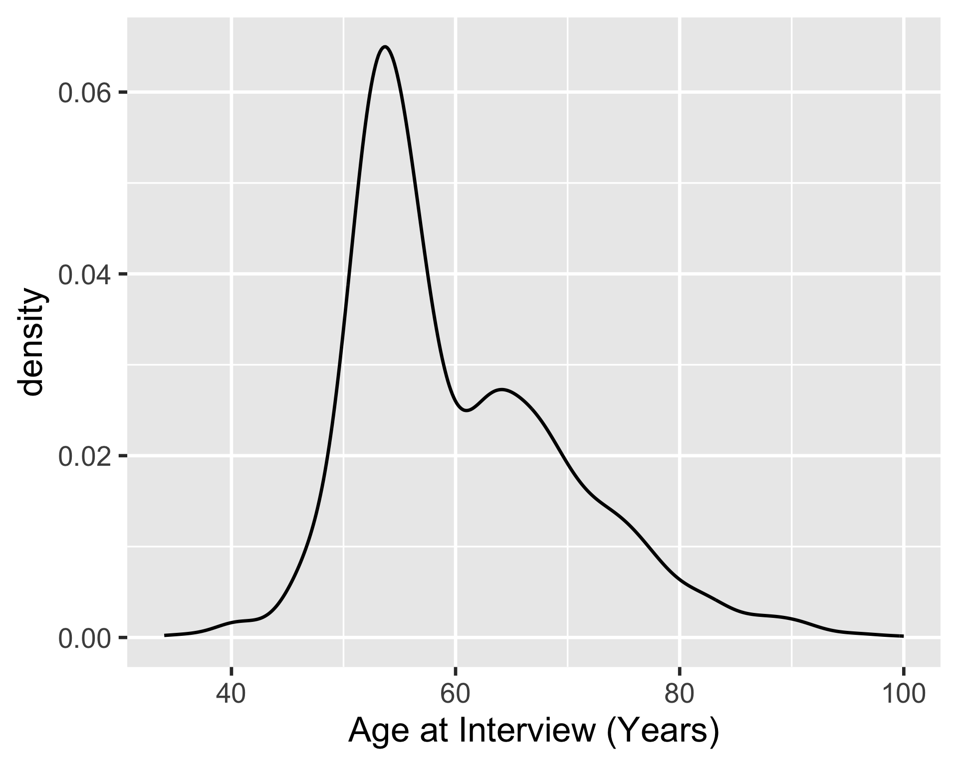
ggplot(hrs_00) +
  geom_density(aes(x = age_yr))
2
The geom_density() function is used to create a density plot of the age_yr variable.

Example 1: One continuous variable (2/2)
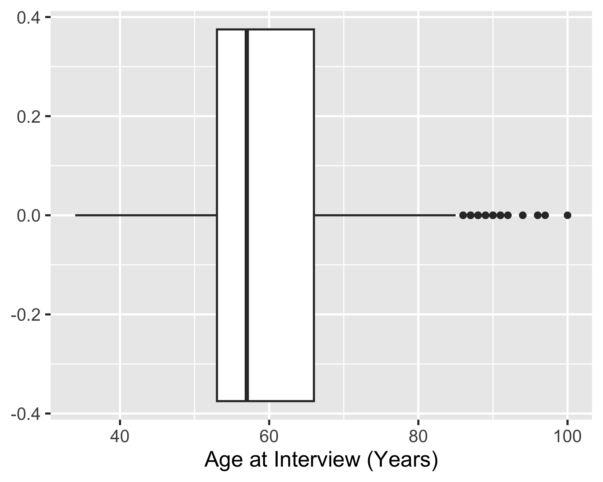
ggplot(hrs_00) +
  geom_boxplot(aes(x = age_yr))
3
The geom_boxplot() function is used to create a boxplot of the age_yr variable.

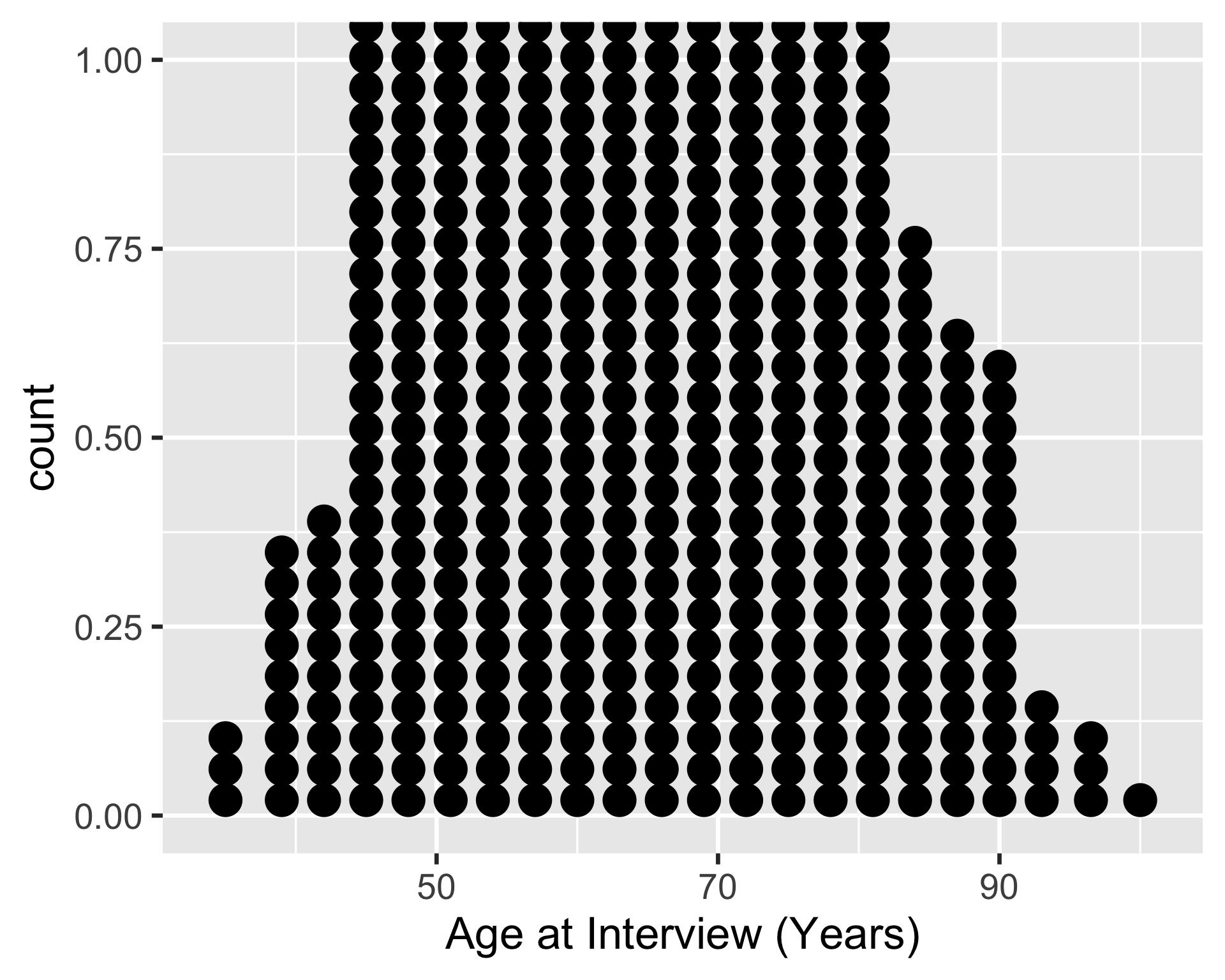
ggplot(hrs_00) +
  geom_dotplot(aes(x = age_yr))
4
The geom_dotplot() function is used to create a dot plot of the age_yr variable.

Example 2: One continuous, one categorical variable (1/2)
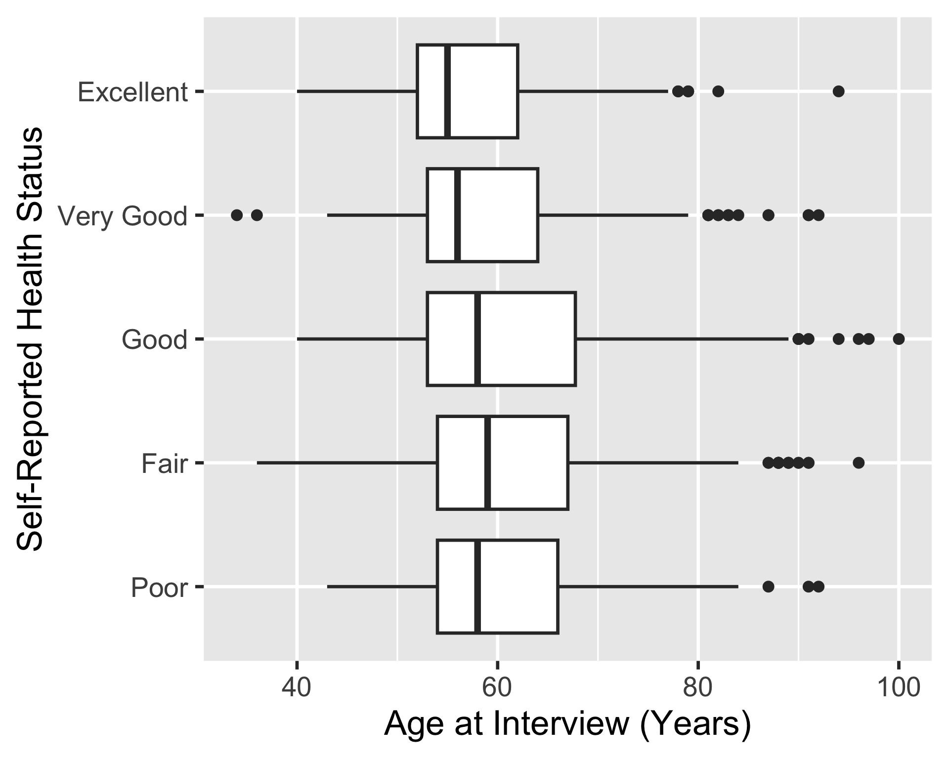
ggplot(hrs_00) +
  geom_boxplot(
    aes(x = age_yr, y = srh)
    )
1
The geom_boxplot() function is used to create a boxplot of the age_yr variable (on the x-axis), grouped by the srh variable (on the y-axis).

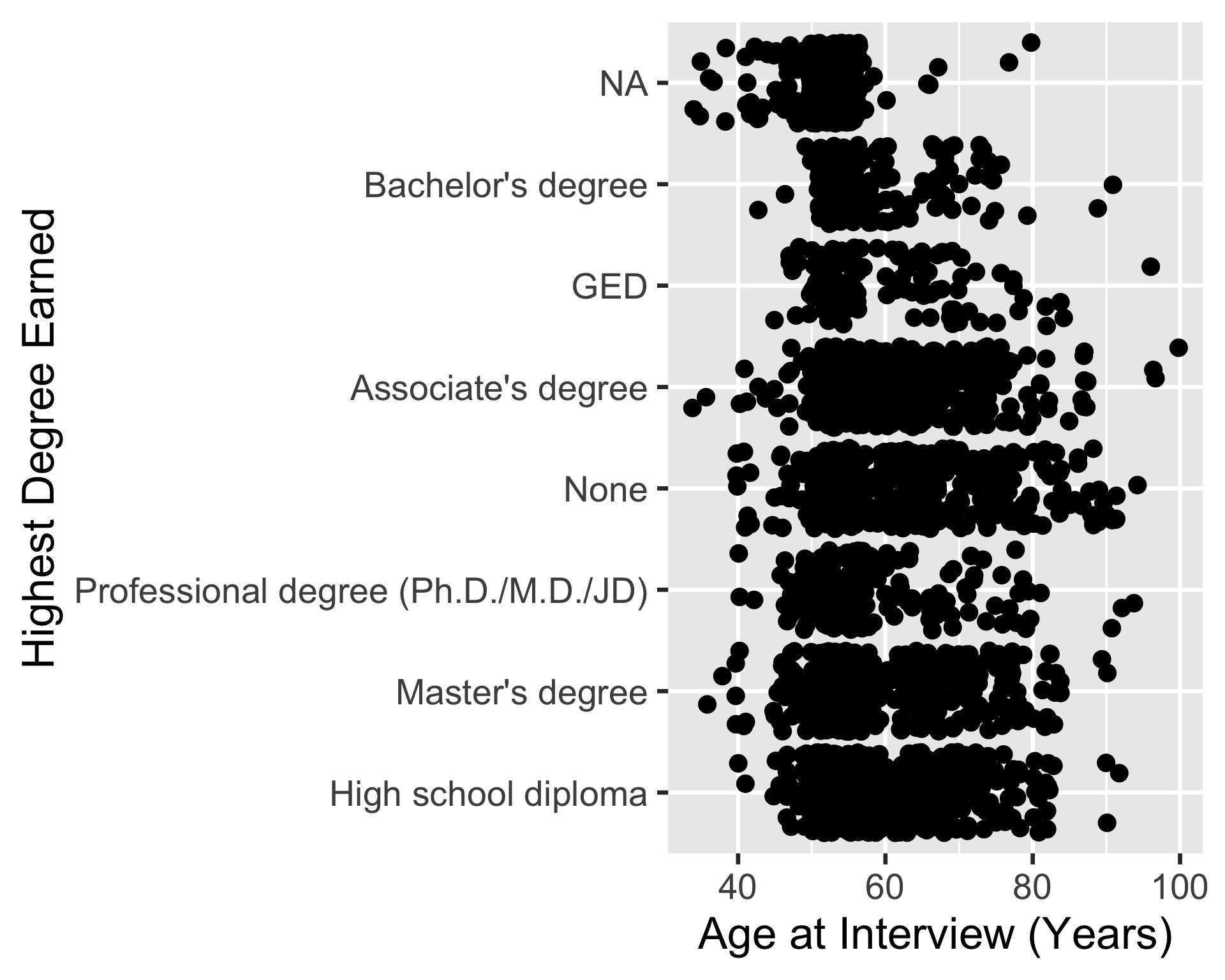
ggplot(hrs_00) +
  geom_jitter(
    aes(x = age_yr, y = srh)
    )
2
The geom_jitter() function is used to create a scatterplot of the age_yr variable (on the x-axis), grouped by the srh variable (on the y-axis). The points are jittered (spaced apart) to avoid overplotting.

Example 2: One continuous, one categorical variable (1/2)
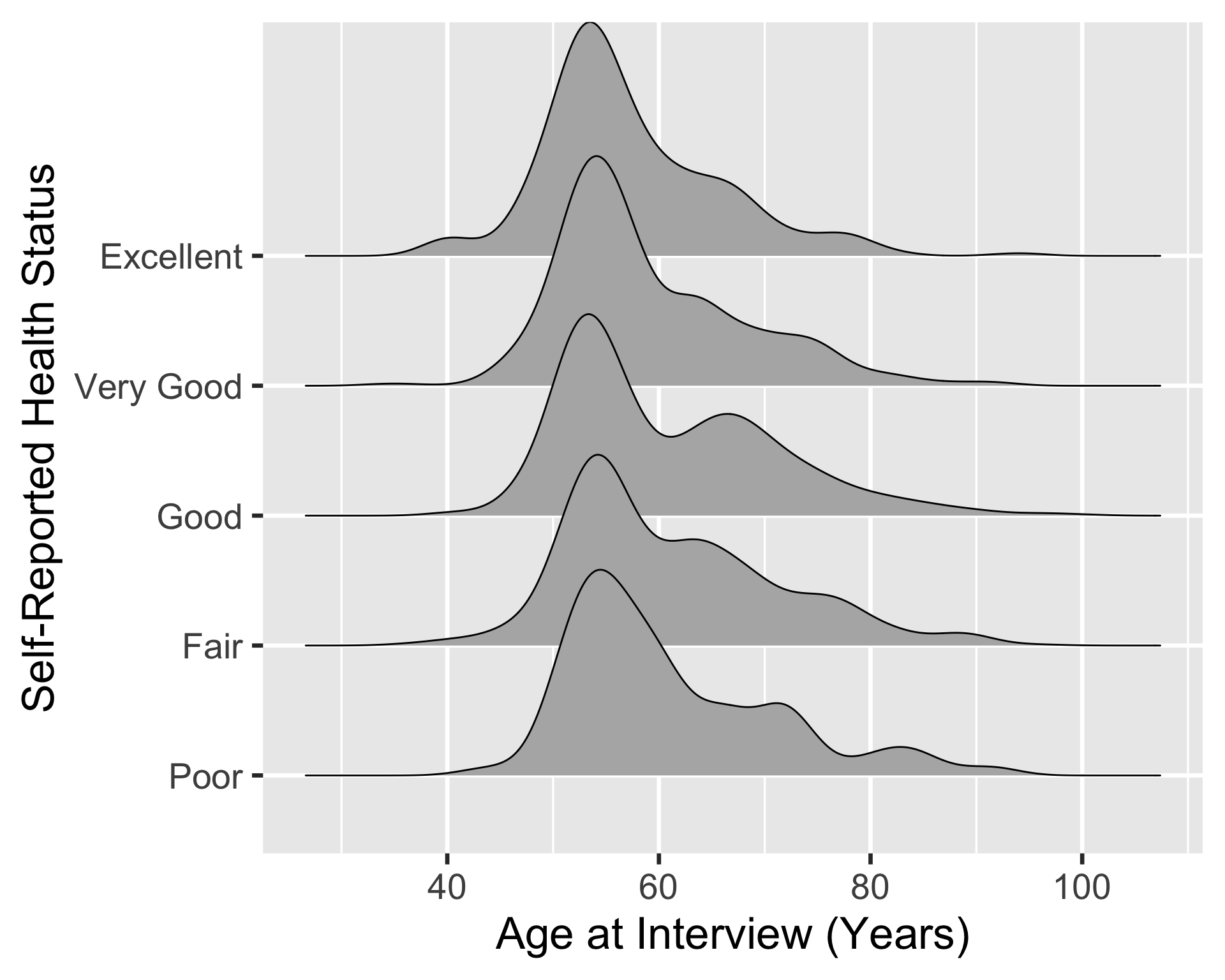
pacman::p_load(ggridges)
ggplot(hrs_00) +
  geom_density_ridges(
    aes(x = age_yr, y = srh)
    )
1
The ggridges package is needed for the geom_density_ridges() function.
2
We can use geom_density_ridges() to create a density plots of the age_yr variable (on the x-axis), grouped by the srh variable (on the y-axis). The density plots are stacked on top of each other to create a ridge plot.
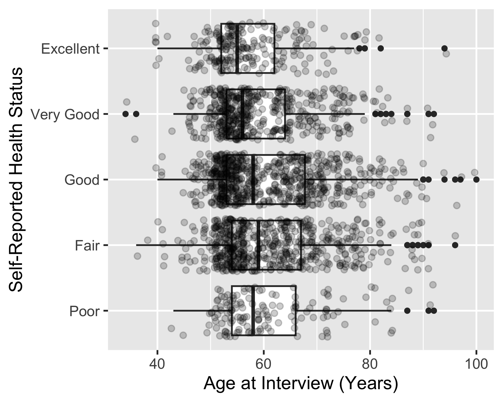
ggplot(
  hrs_00, 
  aes(x = age_yr, y = srh)
  ) +
  geom_boxplot() +
  geom_jitter(alpha = 0.2)
3
We can move aes() into ggplot() since both geom_boxplot() and geom_jitter() use the same mapping
4
We can add a boxplot
5
Then we can stack a jitter plot on top of the boxplot to show the individual data points. The alpha argument is used to make the points more transparent.
Aesthetic mapping/setting

  • If we want to change the visual properties of the plotted data, we use aesthetic mapping/setting
    • This is not about the design choices of the figure, but the aesthetics of the data representation
  • Here are a list of common aesthetic options (from the Epi Handbook):
    • x = The x-axis variable
    • y = The y-axis variable
    • shape = Display a point with geom_point() as a dot, star, triangle, or square…
    • fill = The interior color (e.g. of a bar or boxplot)
    • color = The exterior line of a bar, boxplot, etc., or the point color if using geom_point()
    • size = Size (e.g. line thickness, point size)
    • alpha = Transparency (1 = opaque, 0 = invisible)
    • binwidth = Width of histogram bins (for geom_histogram() only)
    • width = Width of bar plot columns (for geom_bar() only)
    • linetype = Line type (e.g. solid, dashed, dotted)

Example 3: Scatterplot of age vs. self-reported health
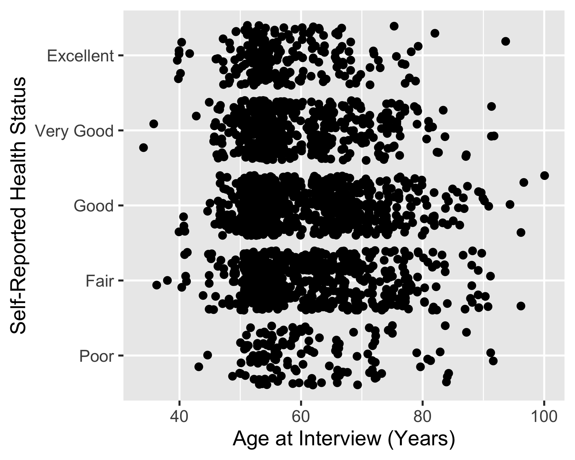
Original scatterplot of age vs. self-reported health
ggplot(
  hrs_00,
  aes(x = age_yr, y = srh)
  ) +
  geom_jitter()

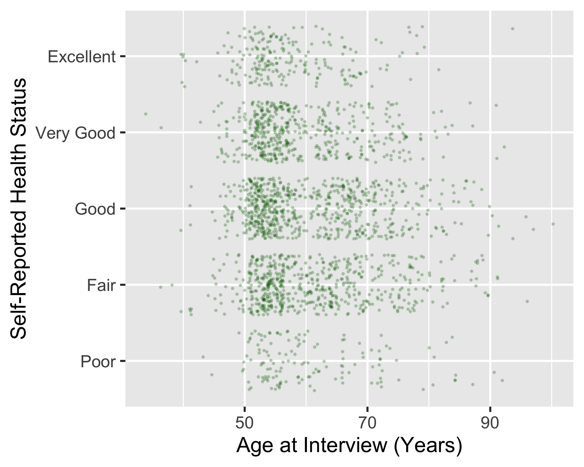
Scatterplot with changed data aesthetics
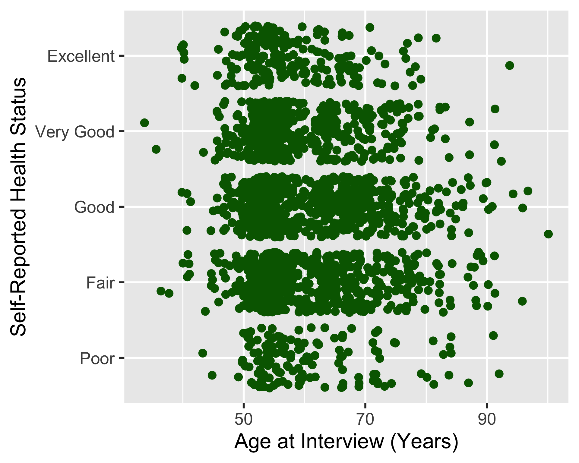
ggplot(
  hrs_00, 
  aes(x = age_yr, y = srh)
  ) +
  geom_jitter(
      color = "darkgreen",
      size = 0.5,
      alpha = 0.2
    )
1
We changed the color of the points to dark green
2
We changed the size of the points to 0.5 (smaller than the default size of 1)
3
We changed the transparency of the points to 0.2 (more transparent than the default alpha of 1)
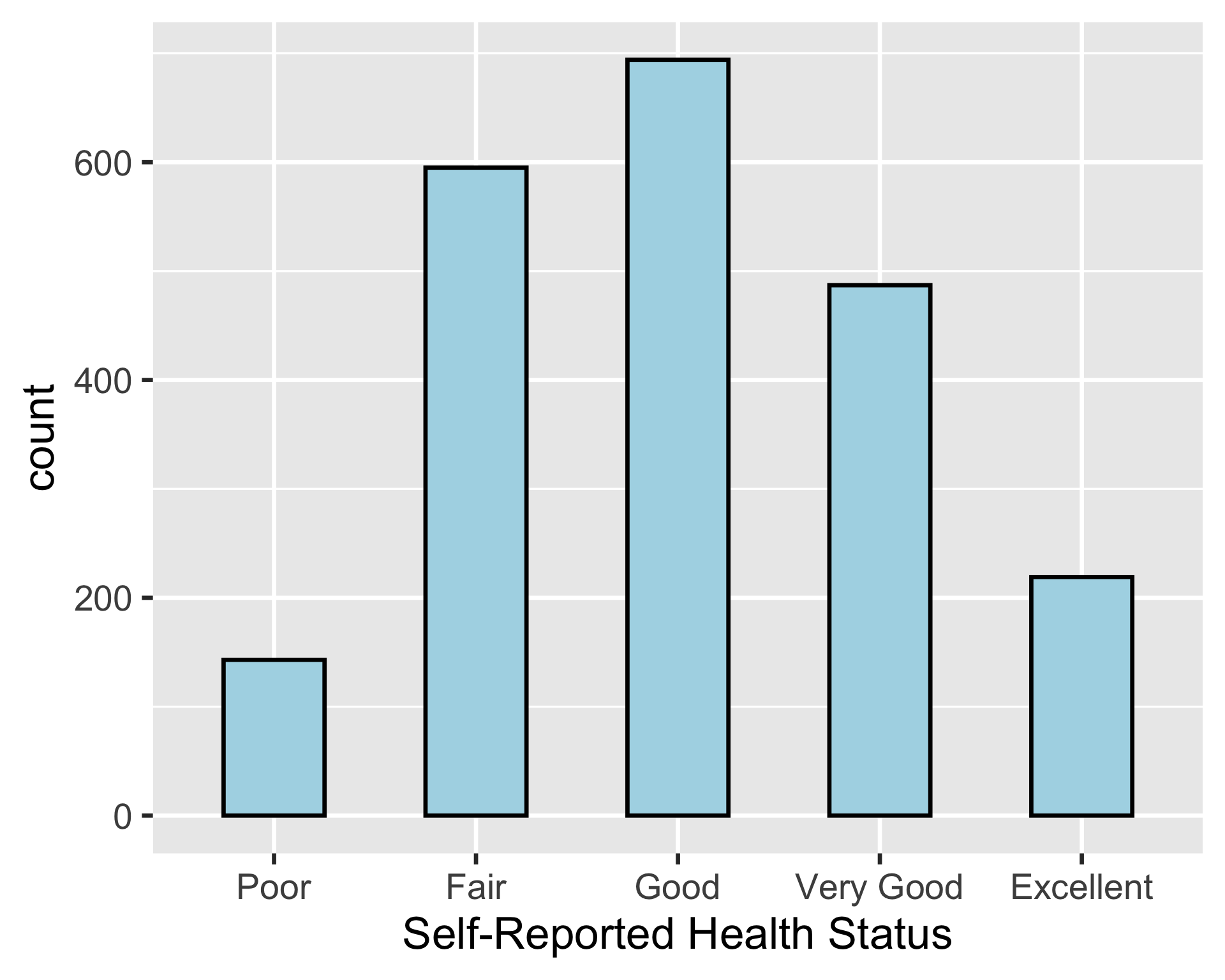
Example 4: Barplot of self-rated health

ggplot(
  hrs_00, 
  aes(x = srh)
  ) +
  geom_bar(
    color = "black",
    fill = "lightblue",
    width = 0.5
    )
1
We changed the color of the bars to black (color is the outline of the bars)
2
We changed the fill color of the bars to light blue
3
We changed the width of the bars to 0.5 (we would use binwidth for geom_histogram())

BIG WARNING!

Color is often NOT needed in a plot!!

  • In general, when you add color, you should adding information to the plot, not just for aesthetics
  • And that color should not be conveyed by existing text

Two ways of setting aesthetics

Outside aes() (aesthetic setting)

  • This is what we’ve been doing so far
  • We set the aesthetics of the data to a specific value
    • Like darkgreen or 0.5
  • These settings are not based on the data

For example:

ggplot(
  hrs_00,
  aes(x = age_yr, y = srh)
  ) +
  geom_jitter(color = "darkgreen")
1
darkgreen is a specific value within geom_jitter() but not in aes()

Inside aes() (aesthetic mapping)

  • We can also set the aesthetics of the data based on the data itself
  • Let’s say we want the type of dots to be based on the self-reported health variable
    • We can do this by putting the shape aesthetic inside aes()

For example:

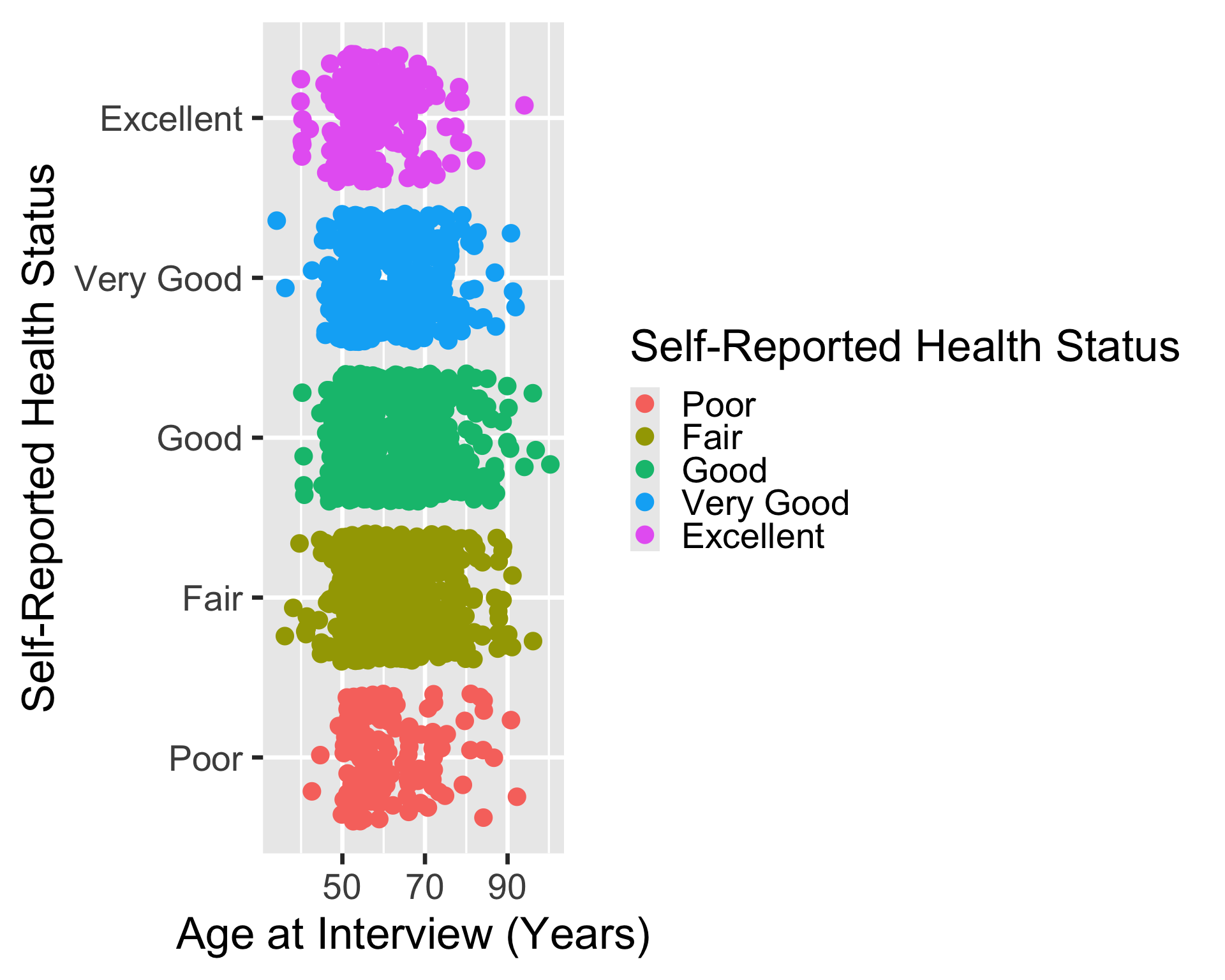
ggplot(
  hrs_00,
  aes(x = age_yr, y = srh, color = srh)
  ) +
  geom_jitter()
2
Now we put color = srh inside aes() so that the color of the dots is based on the self-reported health variable

Example outside and inside aes()

ggplot(
  hrs_00,
  aes(x = age_yr, y = srh)
  ) +
  geom_jitter(color = "darkgreen")

ggplot(
  hrs_00,
  aes(x = age_yr, y = srh, color = srh)
  ) +
  geom_jitter()

Better example of fill/color

  • Color is good when it adds information to the plot
  • This is helpful when we want to compare the distribution of different categories
    • For example: distribution of age in our dataset between males and females
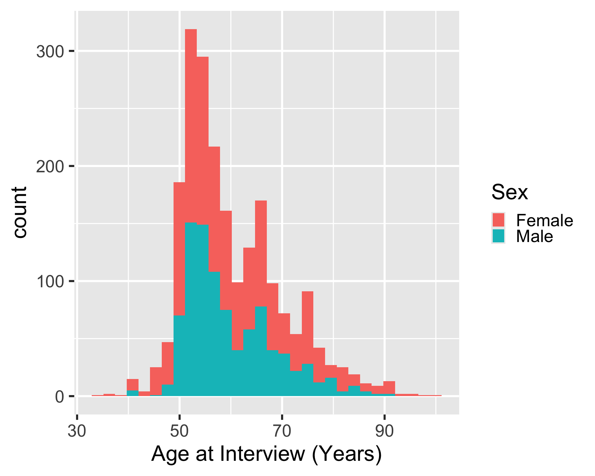
ggplot(
  hrs_00,
  aes(
    x = age_yr, 
    fill = sex
    )
  ) +
  geom_histogram()

Wrap-up

  • We can use different geometric objects to represent data in different ways
  • Some geometric objects only work for certain types of data than others


  • We can set aesthetics of datapoints in ggplot2
    • Including color, fill, size, transparency, shape, and more


  • Color should add information to our plots!

Resources