Data visualization: Design choices

Nicky Wakim

Recall: common components of ggplot2

  • Common components of ggplot2 include:
    • ggplot(): the main function to create a plot
    • aes(): the function to specify the mapping of variables to axes
    • geom_*() or stat_*(): functions to add layers to the plot
    • labs(): the function to change labels of axes and title
    • theme(): the function to adjust non-data plot elements such as text size,


ggplot(
  data = my_data, 
  mapping = aes(x = col1, y = col2)
  ) +
  
  geom_*() +          
  
  labs() +       
  
  theme()                                  

In this lesson, we will focus on labels, themes, and facets.

Basic labelling using labs(): titles and axes

  • We can assign many different labels to a plot using the labs() function

We have the following options for labelling:

ggplot() +     
  geom_*() +          
  labs(
    x = "Label for x-axis",
    y = "Label for y-axis",
    color = "Label for color legend",
    fill = "Label for fill legend",
    title = "Title for the whole plot",
    subtitle = "Appears smaller, under the title", 
    caption = "Appears at the bottom of the plot, good for context" 
  ) +       
  theme()                                  
1
Typically all you need for a plot with two variables.
2
Only needed if you have a legend for color or fill.

Example 1: New labels for our plot of age vs. self-reported health

  • The following example adds all possible labels to the plot
  • We do NOT need to add every possible label!!
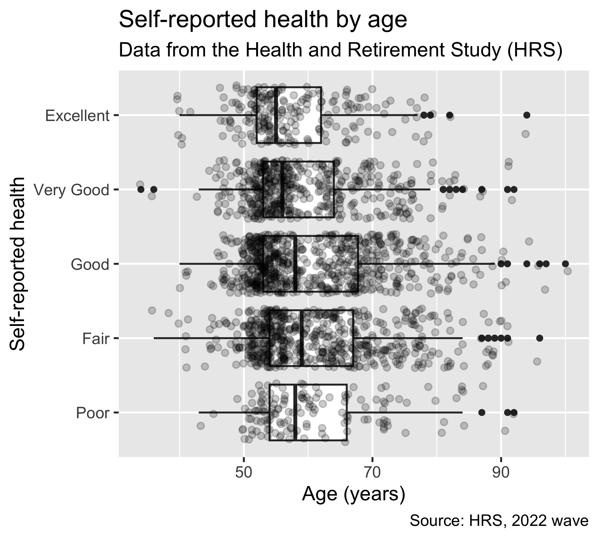
ggplot(
  hrs_00, 
  aes(x = age_yr, y = srh)
  ) +
  geom_boxplot() +
  geom_jitter(alpha = 0.2) +
  labs(
    x = "Age (years)",
    y = "Self-reported health",
    title = "Self-reported health by age",
    subtitle = "Data from the Health and Retirement Study (HRS)",
    caption = "Source: HRS, 2022 wave"
  )

Example 2: Labels for color

  • Note that the HRS dataset came with really nice labels embedded in the .rda file
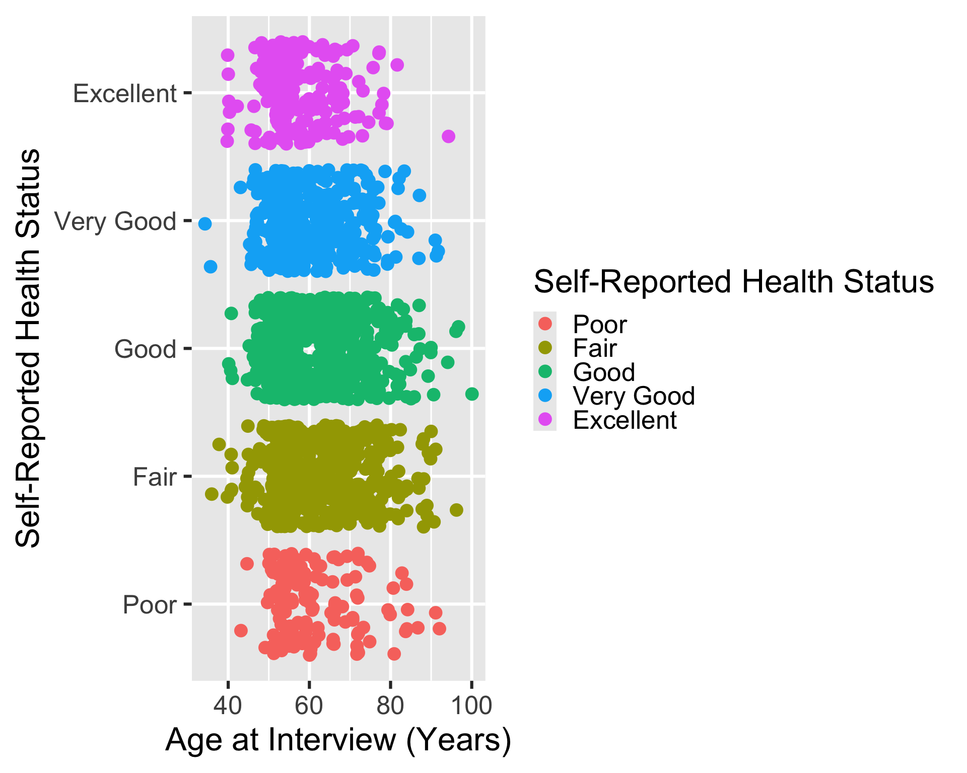
Original labels
ggplot(
  hrs_00,
  aes(x = age_yr, y = srh, color = srh)
  ) +
  geom_jitter()

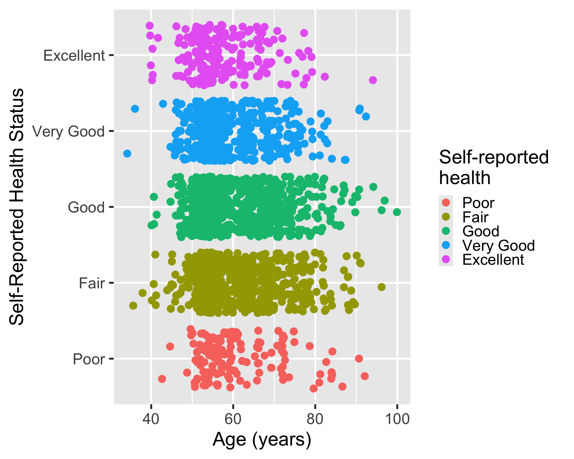
Some label changes
ggplot(
  hrs_00,
  aes(x = age_yr, y = srh, color = srh)
  ) +
  geom_jitter() +
  labs(
    x = "Age (years)",
    color = "Self-reported \nhealth"
  )
1
Take away “at Interview” for x-axis
2
Added \n to condense the horizontal space that the legend title takes up.

Example 3: Same plot without our nice, pre-labelled variables

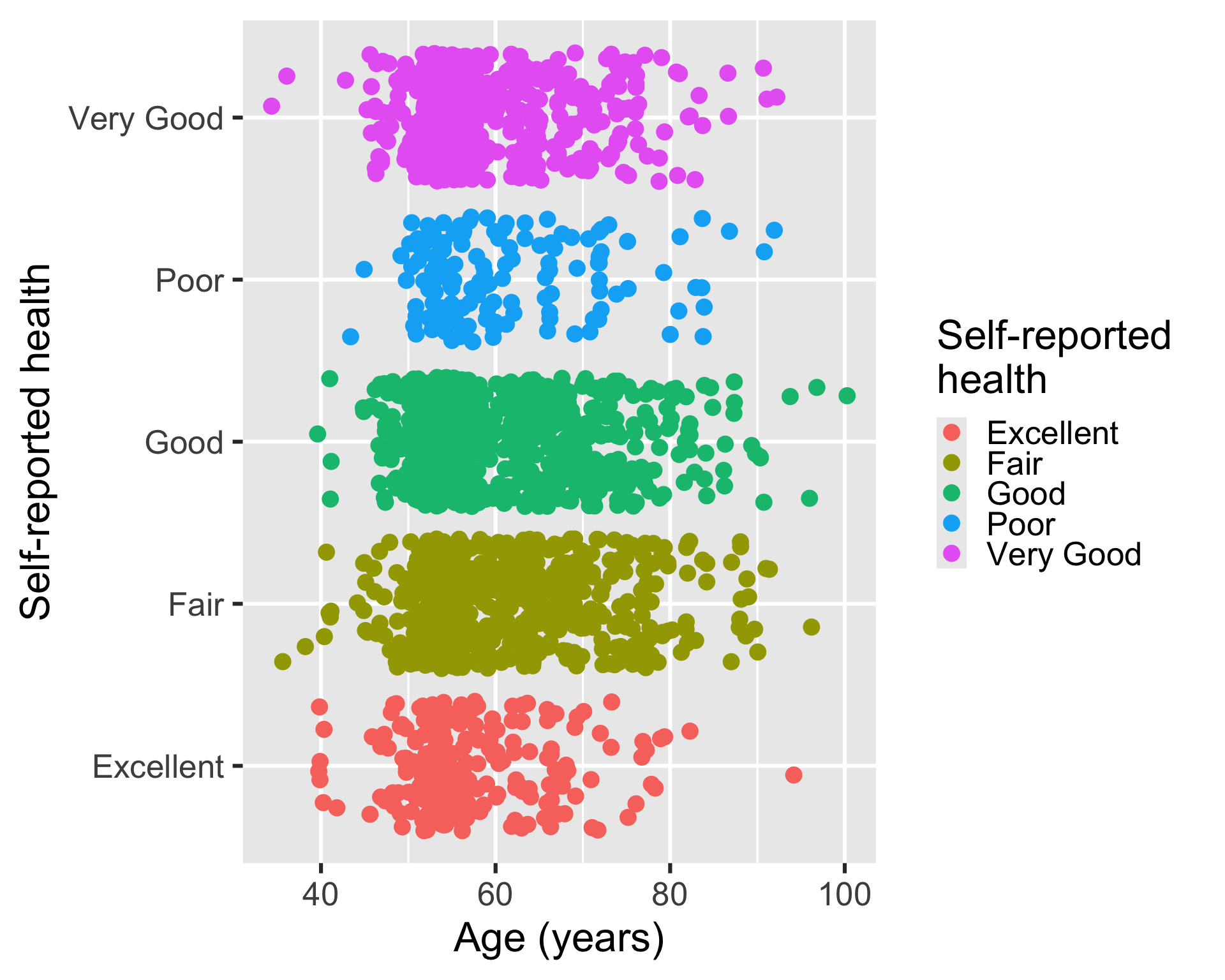
  • If we use the .xlsx file, we lose the labels and the SRH level order.
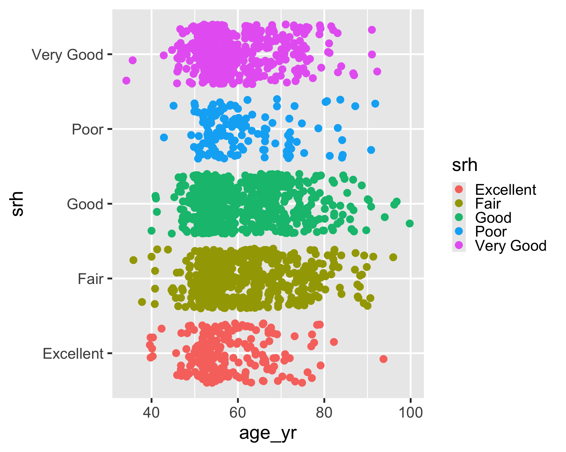
hrs_xlsx <- import(here("data", "hrs_data.xlsx")) |> drop_na()
Variable names are the labels
ggplot(
  hrs_xlsx,
  aes(x = age_yr, y = srh, color = srh)
  ) +
  geom_jitter()

Some label changes
ggplot(
  hrs_xlsx,
  aes(x = age_yr, y = srh, color = srh)
  ) +
  geom_jitter() +
  labs(
    x = "Age (years)",
    y = "Self-reported health", 
    color = "Self-reported \nhealth"
  )
2
Added \n to condense the horizontal space that the legend title takes up.

Facets

  • Facets allow us to create multiple plots based on one or more discrete variables
    • Discrete meaning categorical or whole number values


  • We create multiple plots based on subsets of the data
    • If each subset is determined by one variable, we use facet_wrap()
    • If each subset is determined by two variables, we use facet_grid()

Example 4: facet_wrap()

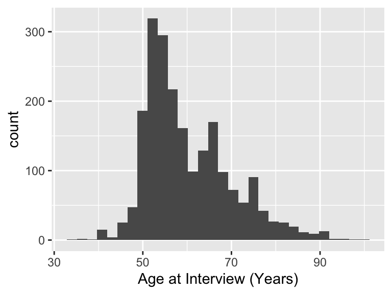
  • We use srh as the facet variable to create a histogram of age for each level of self-reported health
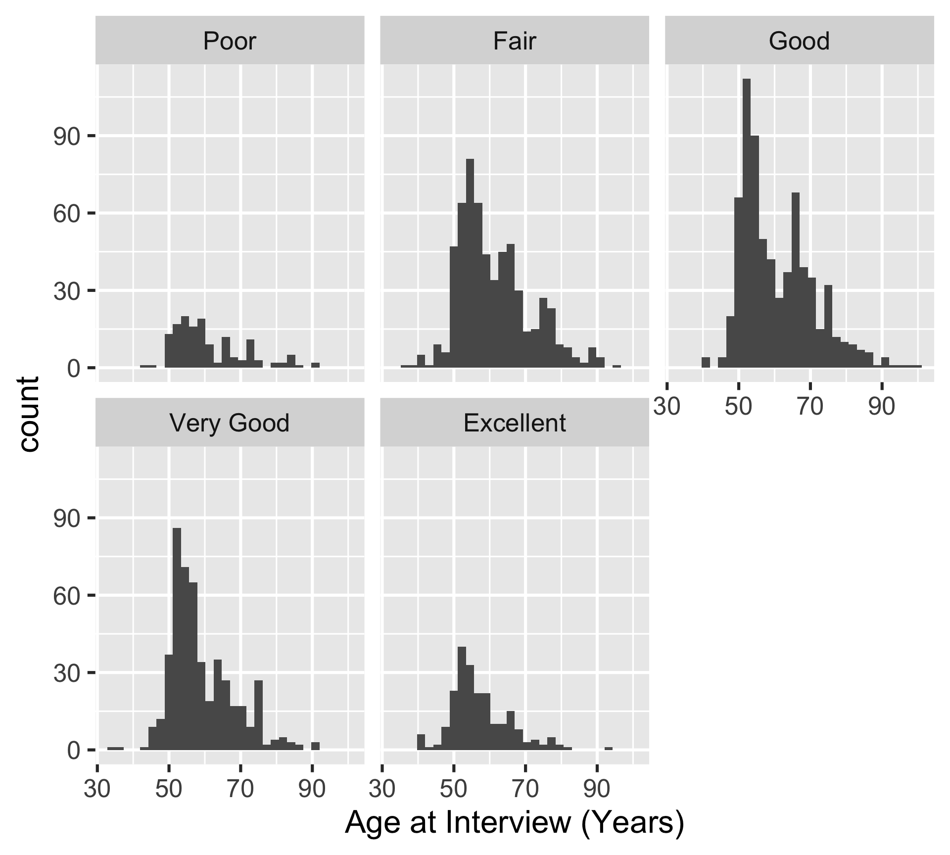
ggplot(
  hrs_00,
  aes(x = age_yr)
  ) +
  geom_histogram() +
  facet_wrap(~ srh)
1
The ~ indicates that we are faceting by a single variable, srh.

Example 5: facet_grid()

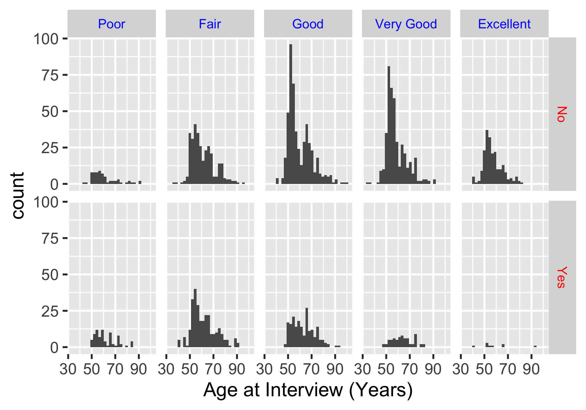
  • We use srh and diab as the facet variables to create a histogram of age for each level of self-reported health and diabetes status
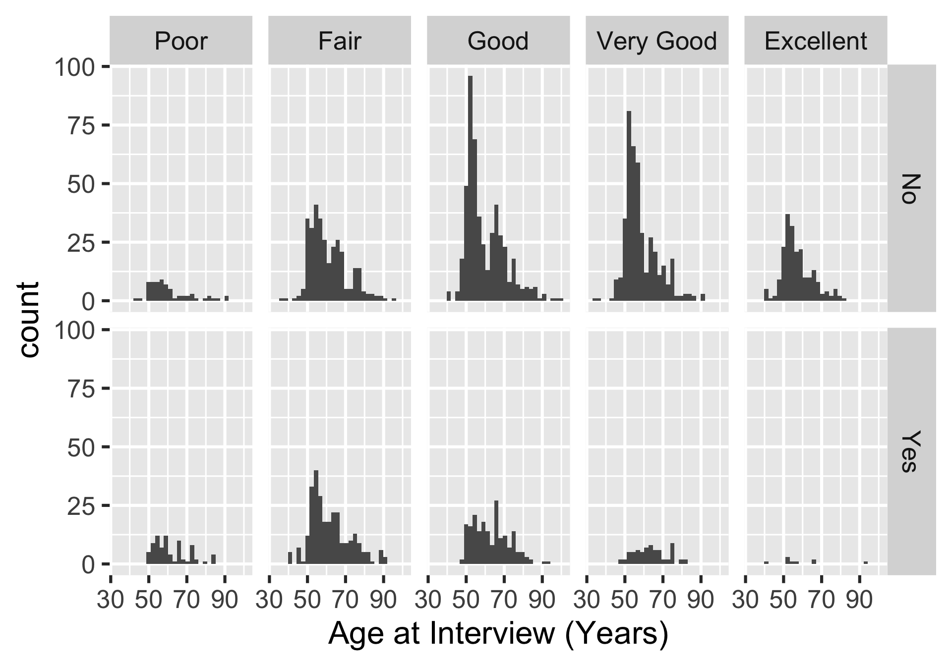
ggplot(
  hrs_00,
  aes(x = age_yr)
  ) +
  geom_histogram() +
  facet_grid(diab ~ srh)
1
The ~ indicates that we are faceting by two variables, diab and srh. The first variable is used for the rows and the second variable is used for the columns.

Complete themes


ggplot(hrs_00) +
  geom_histogram(aes(x = age_yr)) + 
  theme_grey()
1
This is the default theme!

ggplot(hrs_00) +
  geom_histogram(aes(x = age_yr)) +
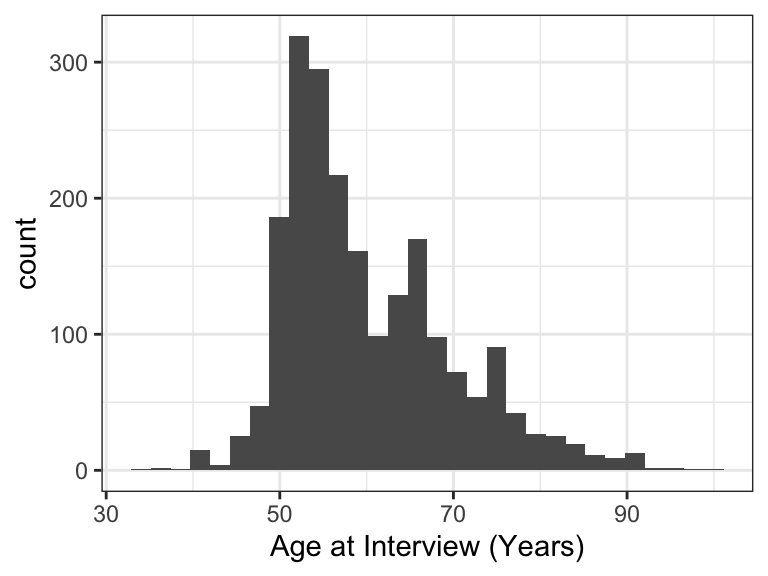
  theme_bw()

ggplot(hrs_00) +
  geom_histogram(aes(x = age_yr)) +
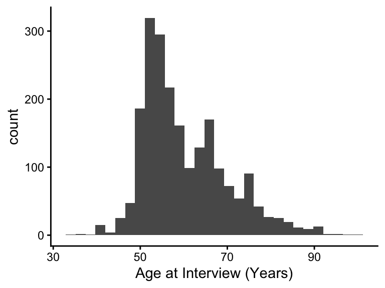
  theme_classic()

ggplot(hrs_00) +
  geom_histogram(aes(x = age_yr)) +
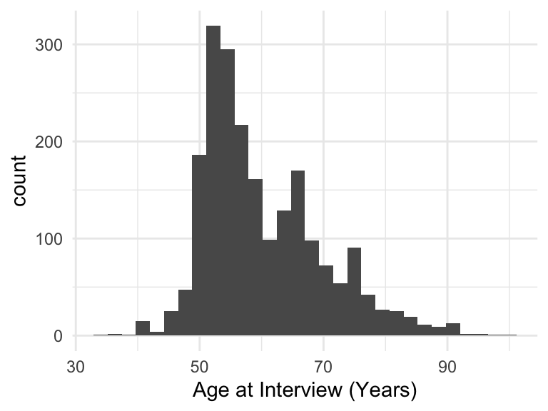
  theme_minimal()

Modifying themes

  • We can change various components of a theme using the theme() function


  • We’re only going to touch the surface here!

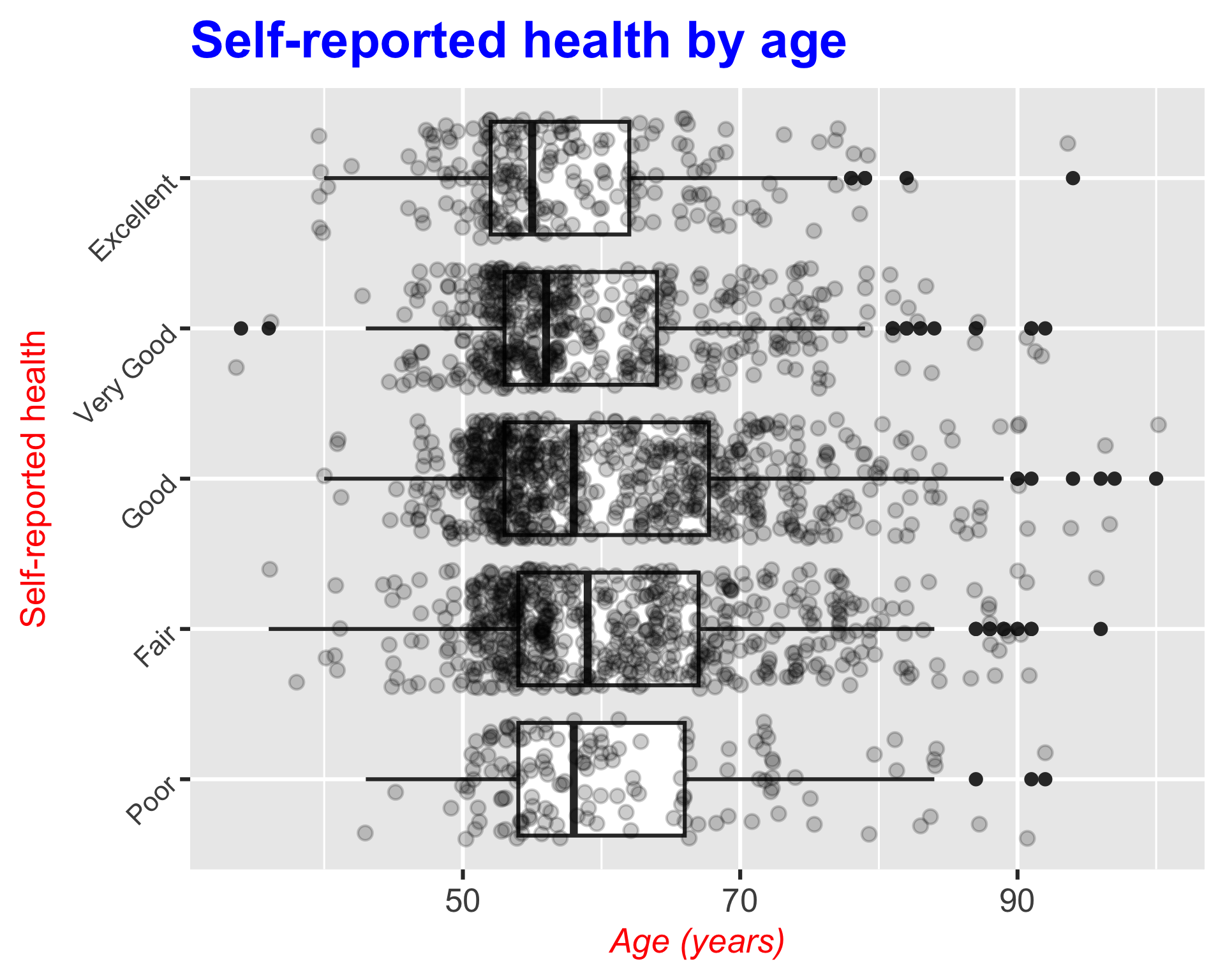
Example 6: Modifying the title and axes

Adding different theme elements
ggplot(
  hrs_00, 
  aes(x = age_yr, y = srh) 
  ) +
  geom_boxplot() + 
  geom_jitter(alpha = 0.2) + 
  labs(
    x = "Age (years)", 
    y = "Self-reported health",
    title = "Self-reported health by age",
  ) +
  theme(
    plot.title = element_text(size = 30, face = "bold", color = "blue"),
    axis.title.x = element_text(size = 20, face = "italic", color = "red"),
    axis.title.y = element_text(size = 20, color = "red"),
    axis.text.y = element_text(size = 16, angle = 45)
  )
1
Changes the title size, makes it bold, and changes the color to blue
2
Changes the x-axis title size, makes it italic, and changes the color to red
3
Changes the y-axis title size and color to red
4
Changes the y-axis text size and rotates it 45 degrees
Example 7: Modifying the facets

Adding different theme elements to facet
ggplot(
  hrs_00,
  aes(x = age_yr)
  ) +
  geom_histogram() +
  facet_grid(diab ~ srh) +
  theme(
    strip.text.x = element_text(size = 16, color = "blue"),
    strip.text.y = element_text(size = 16, color = "red")
  )
1
Changes the facet column label size and color to blue
2
Changes the facet row label size and color to red
Example 8: Modifying the legend

Adding different theme elements to the legend
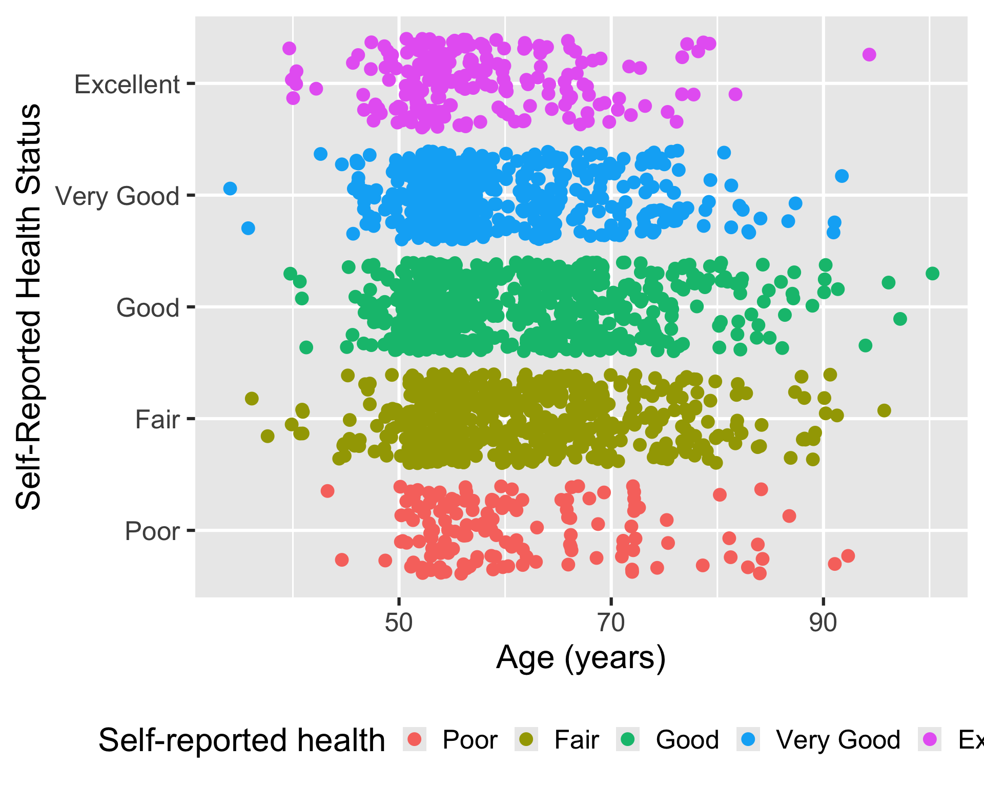
ggplot(
  hrs_00,
  aes(x = age_yr, y = srh, color = srh)
  ) +
  geom_jitter() +
  labs(
    x = "Age (years)", 
    color = "Self-reported health"
  ) +
  theme(
    legend.position = "bottom"
  )
1
Moving the legend to the bottom of the plot instead of the right (default)
Saving plots

  • We can save a plot as an image for later use: way better quality than taking a screenshot of the plot
  • We need to assign the plot to an R object, and then we can save the R object as an image or pdf
  • We use ggsave() to save an R object (that’s a plot)

Let’s say I saved my plot from Example 8 as plot_age_srh:

plot_age_srh <- ggplot(
  hrs_00,
  aes(x = age_yr, y = srh, color = srh)
  ) +
  geom_jitter() +
  labs(
    x = "Age (years)", 
    color = "Self-reported health"
  ) +
  theme(
    legend.position = "bottom"
  )
1
I assign the output (aka my plot) to plot_age_srh
ggsave(
  filename = here(
    "images", 
    "plot_age_srh.png"
    ),
  plot = plot_age_srh,
  width = 5,
  height = 3,
  units = "in",
  dpi = 200)
1
We need to tell R where we want the image to end up in our files
2
We give R the name of the plot
3
We need to adjust the height and width to make the plot readable in the image

Wrap-up

  • We went over additional layers for ggplot2


  • We can use labels to make plots more readable to viewers
  • We can use facets to wrap plots by subsets of data
  • We can use themes to change the overall appearance of a plot
  • We can use ggsave() to save plots as images


  • Check out more on ggplot2: it has a lot of capabilities!

Resources


  • If you found these lessons on Data Visualization fun, I highly suggest you look into Dr. Bedrick’s Data Visualization course in the Spring!