Data Management with the tidyverse

Adapted from parts of Mine Çetinkaya-Rundel’s tidyverse course

Nicky Wakim

2023-01-10

A cartoon of a fuzzy round monster face showing 10 different emotions experienced during the process of debugging code. The progression goes from (1) “I got this” - looking determined and optimistic; (2) “Huh. Really thought that was it.” - looking a bit baffled; (3) “...” - looking up at the ceiling in thought; (4) “Fine. Restarting.” - looking a bit annoyed; (5) “OH WTF.” Looking very frazzled and frustrated; (6) “Zombie meltdown.” - looking like a full meltdown; (7) (blank) - sleeping; (8) “A NEW HOPE!” - a happy looking monster with a lightbulb above; (9) “insert awesome theme song” - looking determined and typing away; (10) “I love coding” - arms raised in victory with a big smile, with confetti falling.

Artwork by @allison_horst

Introduction to the tidyverse

What is the tidyverse?

The tidyverse is a collection of R packages designed for data science. All packages share an underlying design philosophy, grammar, and data structures.

  • ggplot2 - data visualisation
  • dplyr - data manipulation
  • tidyr - tidy data
  • readr - read rectangular data
  • purrr - functional programming
  • tibble - modern data frames
  • stringr - string manipulation
  • forcats - factors
  • and many more …

Tidy data1

tidy data diagram

  1. Each variable must have its own column.

  2. Each observation must have its own row.

  3. Each value must have its own cell.

Pipe operator (magrittr)

  • The pipe operator (%>%) allows us to step through sequential functions in the same way we follow if-then statements or steps from instructions


I want to find my keys, then start my car, then drive to work, then park my car.


Nested

park(drive(start_car(find("keys")), 
           to = "work"))

Piped

find("keys") %>%
  start_car() %>%
  drive(to = "work") %>%
  park()

Recoding a binary variable with pipe operator


Let’s say I want a variable transmission to show the category names that are assigned to numeric values in the code. I want 0 to be coded as automatic and 1 to be coded as manual.


Base R:

mtcars$transmission <-
  ifelse(
    mtcars$am == 0,
    "automatic",
    "manual"
  )

Tidyverse:

mtcars <- mtcars %>%
  mutate(
    transmission = case_when(
      am == 0 ~ "automatic",
      am == 1 ~ "manual"
    )
  )


mutate() creates new columns that are functions of existing variables

Recoding a multi-level variable


Let’s say I want a variable gear to show the category names that are assigned to numeric values in the code. I want 3 to be coded as gear three, 4 to be coded as gear four, 5 to be coded as gear five.


Base R:

mtcars$gear_char <-
  ifelse(
    mtcars$gear == 3,
    "three",
    ifelse(
      mtcars$gear == 4,
      "four",
      "five"
    )
  )

Tidyverse:

mtcars <- mtcars %>%
  mutate(
    gear_char = case_when(
      gear == 3 ~ "three",
      gear == 4 ~ "four",
      gear == 5 ~ "five"
    )
  )

ggplot2 revisited

ggplot2 in tidyverse

  • We talked about this in our review notes

    • I want to revisit it: always helps to have more examples!
    • This example is closer to the multivariable work we’ll do in this class!


  • ggplot2 is tidyverse’s data visualization package


  • The gg in “ggplot2” stands for Grammar of Graphics


  • It is inspired by the book Grammar of Graphics by Leland Wilkinson

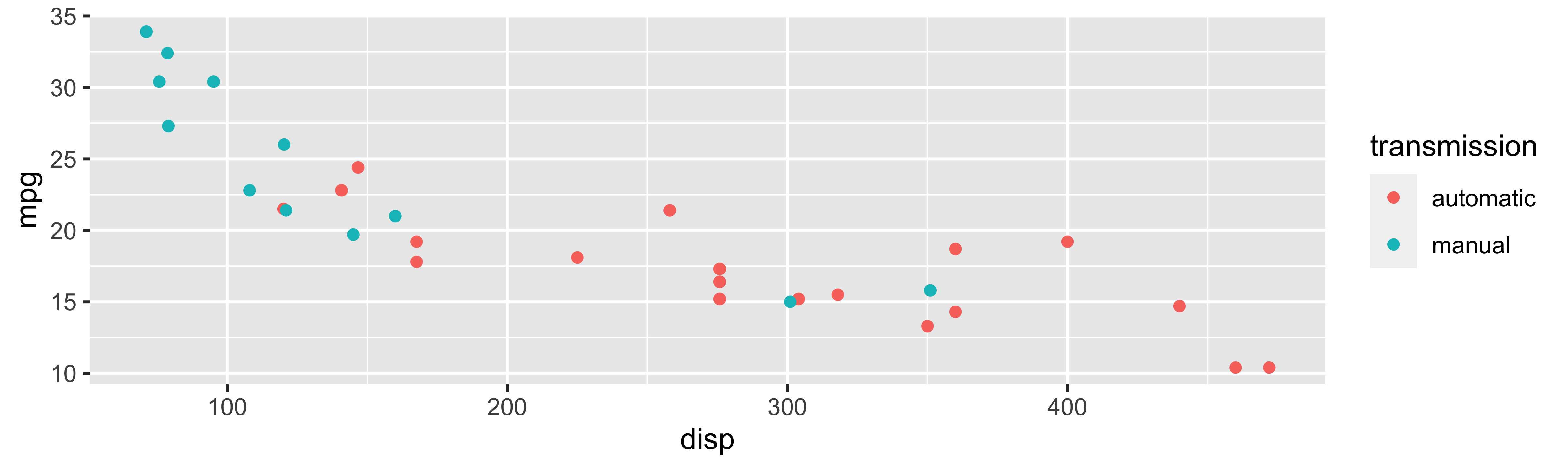
Tidyverse: Visualizing multiple variables


ggplot(
  mtcars,
  aes(x = disp, y = mpg, color = transmission)) +
  geom_point()

Poll Everywhere Question 1

Tidyverse: Visualizing even more variables

ggplot(
  mtcars,
  aes(x = disp, y = mpg, color = transmission)) +
  geom_point() +
  facet_wrap(~ cyl)

Base R: Visualizing even more variables

mtcars$trans_color <- ifelse(mtcars$transmission == "automatic", "green", "blue")
mtcars_cyl4 = mtcars[mtcars$cyl == 4, ]
mtcars_cyl6 = mtcars[mtcars$cyl == 6, ]
mtcars_cyl8 = mtcars[mtcars$cyl == 8, ]
par(mfrow = c(1, 3), mar = c(2.5, 2.5, 2, 0), mgp = c(1.5, 0.5, 0))
plot(mpg ~ disp, data = mtcars_cyl4, col = trans_color, main = "Cyl 4")
plot(mpg ~ disp, data = mtcars_cyl6, col = trans_color, main = "Cyl 6")
plot(mpg ~ disp, data = mtcars_cyl8, col = trans_color, main = "Cyl 8")
legend("topright", legend = c("automatic", "manual"), pch = 1, col = c("green", "blue"))
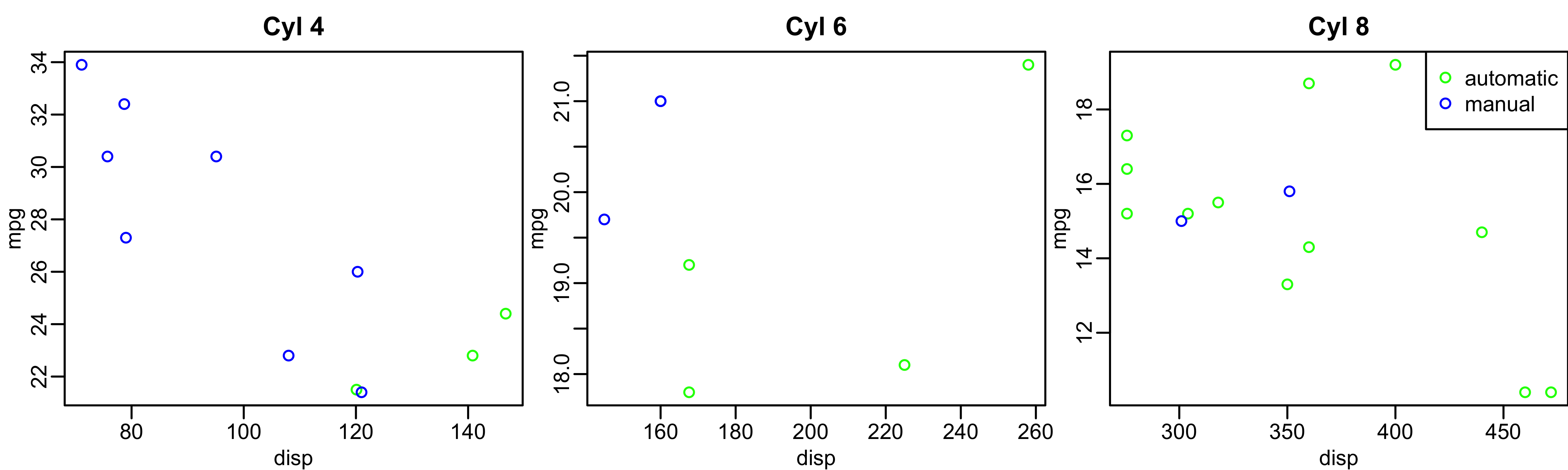
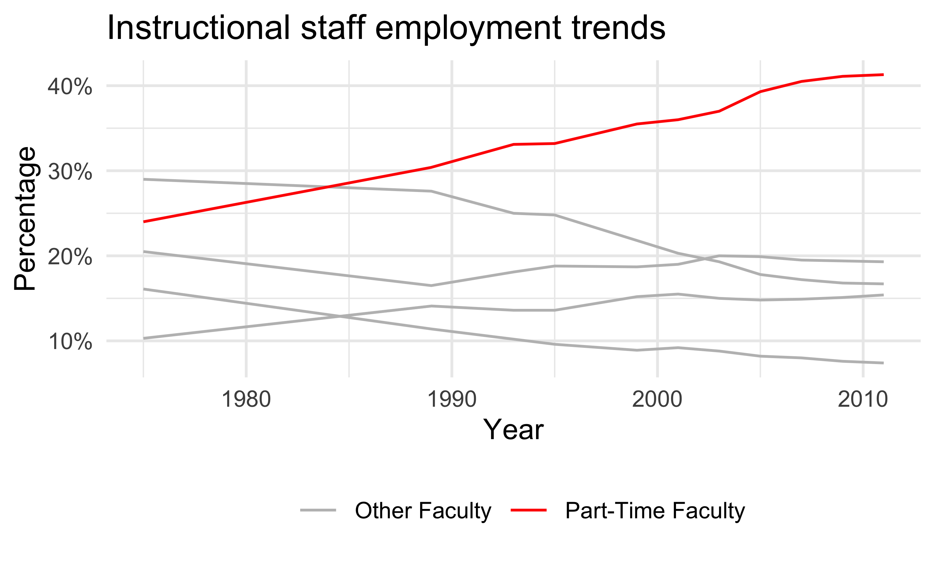
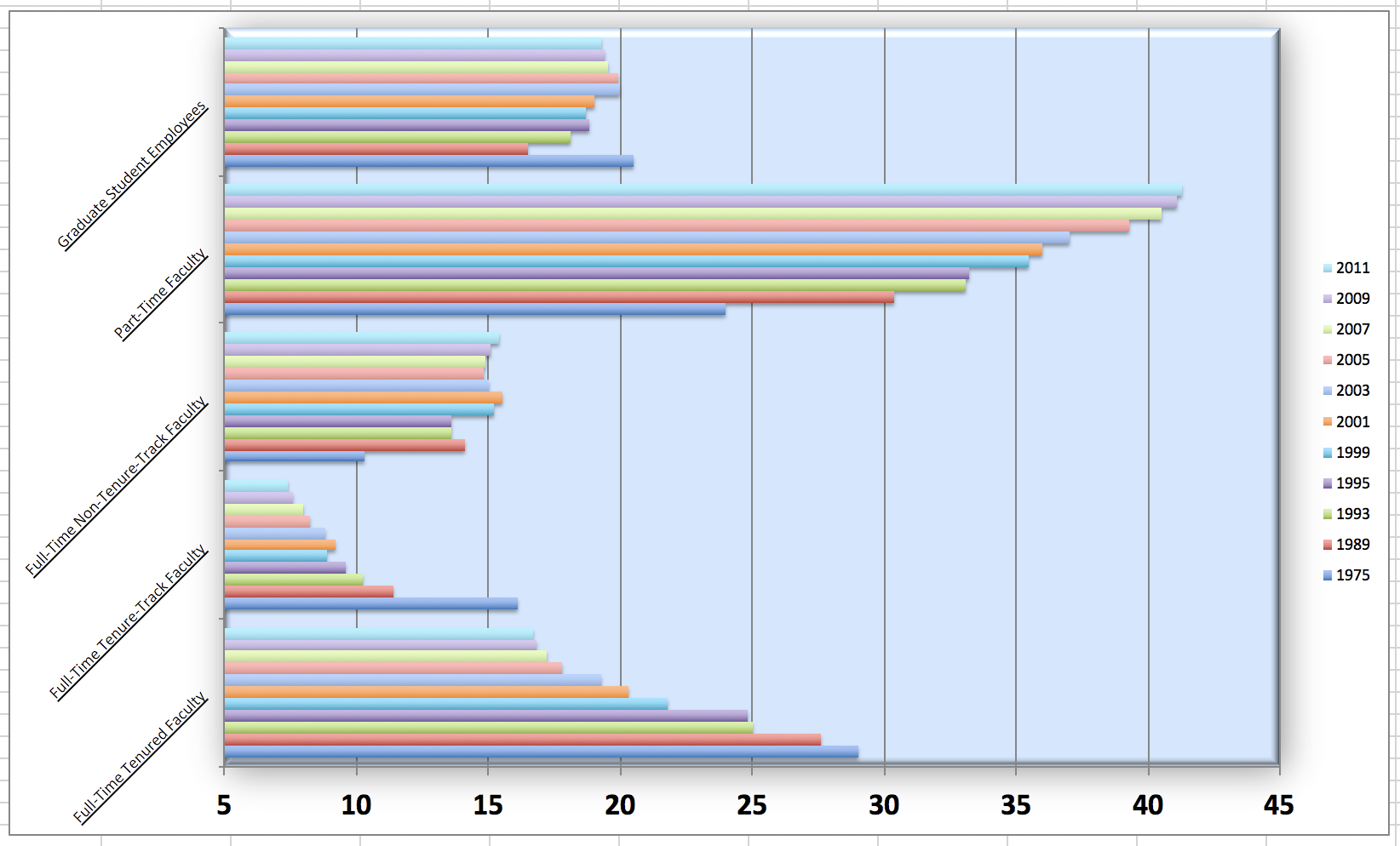
Functions for data management

Important functions for data management


Data manipulation

  • pivot_longer() and pivot_wider()

  • rename()

  • mutate()

  • filter()

  • select()

Summarizing data

  • tbl_summary()
  • group_by()
  • summarize()
  • across()

Data manipulation

Data

Each row in this dataset represents a faculty type, and the columns are the years for which we have data. The values are percentage of hires of that type of faculty for each year.


(staff <- read_csv("data/instructional-staff.csv"))
# A tibble: 5 × 12
  faculty_type    `1975` `1989` `1993` `1995` `1999` `2001` `2003` `2005` `2007`
  <chr>            <dbl>  <dbl>  <dbl>  <dbl>  <dbl>  <dbl>  <dbl>  <dbl>  <dbl>
1 Full-Time Tenu…   29     27.6   25     24.8   21.8   20.3   19.3   17.8   17.2
2 Full-Time Tenu…   16.1   11.4   10.2    9.6    8.9    9.2    8.8    8.2    8  
3 Full-Time Non-…   10.3   14.1   13.6   13.6   15.2   15.5   15     14.8   14.9
4 Part-Time Facu…   24     30.4   33.1   33.2   35.5   36     37     39.3   40.5
5 Graduate Stude…   20.5   16.5   18.1   18.8   18.7   19     20     19.9   19.5
# ℹ 2 more variables: `2009` <dbl>, `2011` <dbl>

Poll Everywhere Question 2

Recreate the visualization


  • In order to recreate this visualization we need to first reshape the data:
    • one variable for faculty type
    • one variable for year


  • Convert the data from the wide format to long format
    • pivot_longer()

pivot friends meme

pivot_*() functions

Poll Everywhere Question 3

Pivot staff data and mutate percentage

(staff_long <- staff %>%
  pivot_longer(
    cols = -faculty_type,    # columns to pivot
    names_to = "year",       # name of new column for variable names
    values_to = "percentage" # name of new column for values
  ) %>%
  mutate(percentage = as.numeric(percentage))
)
# A tibble: 55 × 3
   faculty_type              year  percentage
   <chr>                     <chr>      <dbl>
 1 Full-Time Tenured Faculty 1975        29  
 2 Full-Time Tenured Faculty 1989        27.6
 3 Full-Time Tenured Faculty 1993        25  
 4 Full-Time Tenured Faculty 1995        24.8
 5 Full-Time Tenured Faculty 1999        21.8
 6 Full-Time Tenured Faculty 2001        20.3
 7 Full-Time Tenured Faculty 2003        19.3
 8 Full-Time Tenured Faculty 2005        17.8
 9 Full-Time Tenured Faculty 2007        17.2
10 Full-Time Tenured Faculty 2009        16.8
# ℹ 45 more rows

A “meh” plot over the years
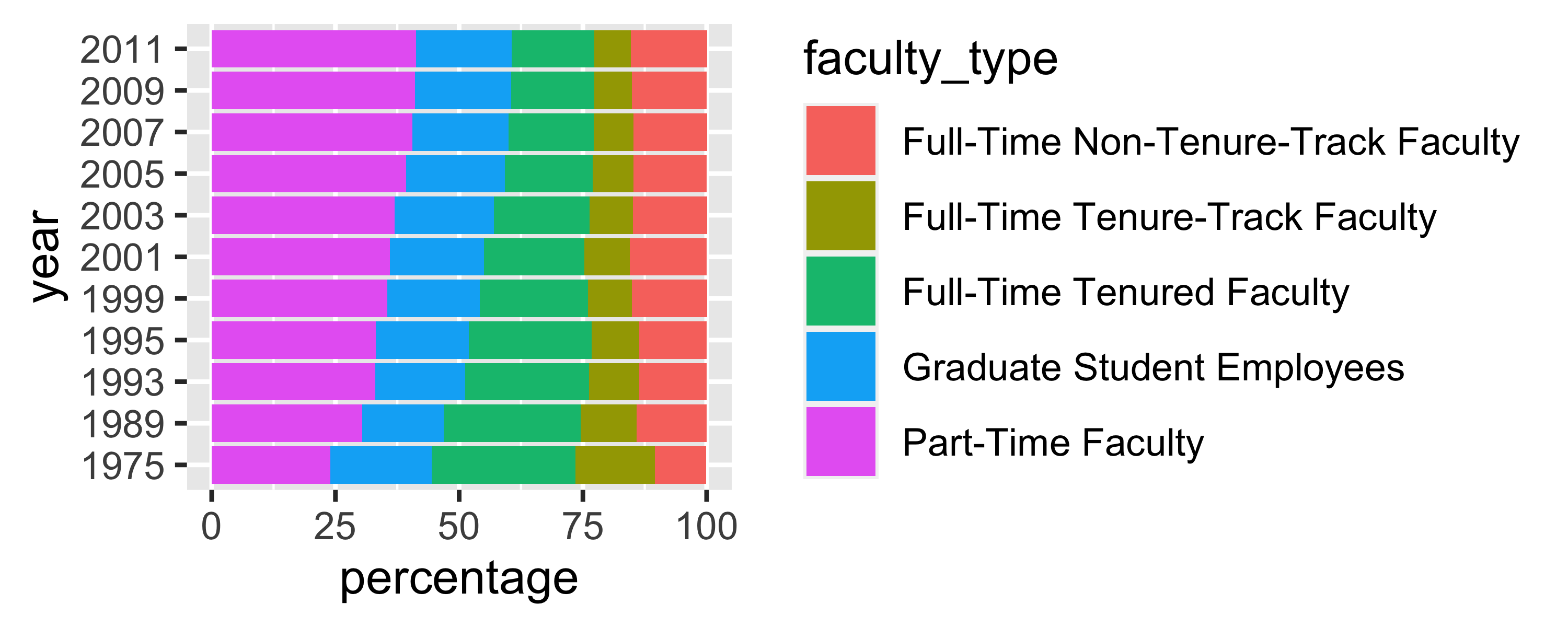
ggplot(staff_long, aes(x = percentage, y = year, fill = faculty_type)) +
  geom_col()

More improvement

staff_long %>%
  mutate( 
    part_time = if_else(faculty_type == "Part-Time Faculty",
                        "Part-Time Faculty", "Other Faculty"),
    year = as.numeric(year)) %>% 
  ggplot(
    aes(x = year, y = percentage/100, group = faculty_type, color = part_time)) +
  geom_line() +
  scale_color_manual(values = c("gray", "red")) + 
  scale_y_continuous(labels = label_percent(accuracy = 1)) + 
  theme_minimal() +
  labs(
    title = "Instructional staff employment trends",
    x = "Year", y = "Percentage", color = NULL) +
  theme(legend.position = "bottom")

All that just to show one helpful function

Now we can move onto the other functions mentioned:


Data manipulation

  • pivot_longer() and pivot_wider()

  • rename()

  • mutate()

  • filter()

  • select()

Summarizing data

  • tbl_summary()
  • group_by()
  • summarize()
  • across()

Let’s look back at the dds.discr dataset that I briefly used last class


  • We will load the data (This is a special case! dds.discr is a built-in R dataset)
data("dds.discr")
  • Now, let’s take a glimpse at the dataset:
glimpse(dds.discr)
Rows: 1,000
Columns: 6
$ id           <int> 10210, 10409, 10486, 10538, 10568, 10690, 10711, 10778, 1…
$ age.cohort   <fct> 13-17, 22-50, 0-5, 18-21, 13-17, 13-17, 13-17, 13-17, 13-…
$ age          <int> 17, 37, 3, 19, 13, 15, 13, 17, 14, 13, 13, 14, 15, 17, 20…
$ gender       <fct> Female, Male, Male, Female, Male, Female, Female, Male, F…
$ expenditures <int> 2113, 41924, 1454, 6400, 4412, 4566, 3915, 3873, 5021, 28…
$ ethnicity    <fct> White not Hispanic, White not Hispanic, Hispanic, Hispani…

rename(): one of the first things I usually do

  • I notice that two variables have values that don’t necessarily match the variable name

    • Female and male are not genders

    • “White not Hispanic” combines race and ethnicity into one category

I want to rename gender to SAB (sex assigned at birth) and rename ethnicity to R_E (race and ethnicity)


dds.discr1 = dds.discr %>% 
  rename(SAB = gender, 
         R_E = ethnicity)

glimpse(dds.discr1)
Rows: 1,000
Columns: 6
$ id           <int> 10210, 10409, 10486, 10538, 10568, 10690, 10711, 10778, 1…
$ age.cohort   <fct> 13-17, 22-50, 0-5, 18-21, 13-17, 13-17, 13-17, 13-17, 13-…
$ age          <int> 17, 37, 3, 19, 13, 15, 13, 17, 14, 13, 13, 14, 15, 17, 20…
$ SAB          <fct> Female, Male, Male, Female, Male, Female, Female, Male, F…
$ expenditures <int> 2113, 41924, 1454, 6400, 4412, 4566, 3915, 3873, 5021, 28…
$ R_E          <fct> White not Hispanic, White not Hispanic, Hispanic, Hispani…

mutate(): constructing new variables from what you have

  • We’ve seen a couple examples for mutate() so far (mostly because its used so often!)

  • We haven’t seen an example where we make a new variable from two variables

I want to make a variable that is the ratio of expenditures over age


dds.discr2 = dds.discr1 %>%
  mutate(exp_to_age = expenditures/age)

glimpse(dds.discr2)
Rows: 1,000
Columns: 7
$ id           <int> 10210, 10409, 10486, 10538, 10568, 10690, 10711, 10778, 1…
$ age.cohort   <fct> 13-17, 22-50, 0-5, 18-21, 13-17, 13-17, 13-17, 13-17, 13-…
$ age          <int> 17, 37, 3, 19, 13, 15, 13, 17, 14, 13, 13, 14, 15, 17, 20…
$ SAB          <fct> Female, Male, Male, Female, Male, Female, Female, Male, F…
$ expenditures <int> 2113, 41924, 1454, 6400, 4412, 4566, 3915, 3873, 5021, 28…
$ R_E          <fct> White not Hispanic, White not Hispanic, Hispanic, Hispani…
$ exp_to_age   <dbl> 124.2941, 1133.0811, 484.6667, 336.8421, 339.3846, 304.40…

Poll Everywhere Question 4

filter(): keep rows that match a condition

  • What if I want to subset the data frame? (keep certain rows of observations)

I want to look at the data for people who between 50 and 60 years old


dds.discr3 = dds.discr2 %>%
  filter(age >= 50 & age <= 60)

glimpse(dds.discr3)
Rows: 23
Columns: 7
$ id           <int> 15970, 19412, 29506, 31658, 36123, 39287, 39672, 43455, 4…
$ age.cohort   <fct> 51+, 51+, 51+, 51+, 51+, 51+, 51+, 51+, 51+, 51+, 51+, 51…
$ age          <int> 51, 60, 56, 60, 59, 59, 54, 57, 52, 57, 55, 52, 59, 54, 5…
$ SAB          <fct> Female, Female, Female, Female, Male, Female, Female, Mal…
$ expenditures <int> 54267, 57702, 48215, 46873, 42739, 44734, 52833, 48363, 5…
$ R_E          <fct> White not Hispanic, White not Hispanic, White not Hispani…
$ exp_to_age   <dbl> 1064.0588, 961.7000, 860.9821, 781.2167, 724.3898, 758.20…

select(): keep or drop columns using their names and types

  • What if I want to remove or keep certain variables?

I want to only have age and expenditure in my data frame


dds.discr4 = dds.discr2 %>%
  select(age, expenditures)

glimpse(dds.discr4)
Rows: 1,000
Columns: 2
$ age          <int> 17, 37, 3, 19, 13, 15, 13, 17, 14, 13, 13, 14, 15, 17, 20…
$ expenditures <int> 2113, 41924, 1454, 6400, 4412, 4566, 3915, 3873, 5021, 28…

Summarizing Data

tbl_summary() : table summary (1/2)

  • What if I want one of those fancy summary tables that are at the top of most research articles? (lovingly called “Table 1”)
library(gtsummary)
tbl_summary(dds.discr2)
Characteristic N = 1,0001
id 55,385 (31,809, 76,135)
age.cohort
    0-5 82 (8.2%)
    6-12 175 (18%)
    13-17 212 (21%)
    18-21 199 (20%)
    22-50 226 (23%)
    51+ 106 (11%)
age 18 (12, 26)
SAB
    Female 503 (50%)
    Male 497 (50%)
expenditures 7,026 (2,899, 37,713)
R_E
    American Indian 4 (0.4%)
    Asian 129 (13%)
    Black 59 (5.9%)
    Hispanic 376 (38%)
    Multi Race 26 (2.6%)
    Native Hawaiian 3 (0.3%)
    Other 2 (0.2%)
    White not Hispanic 401 (40%)
exp_to_age 462 (274, 938)
1 Median (IQR); n (%)

tbl_summary() : table summary (2/2)

  • Let’s make this more presentable


dds.discr2 %>%
  select(-id, -age.cohort, -exp_to_age) %>%
  tbl_summary(label = c(age ~ "Age", 
                        R_E ~ "Race/Ethnicity", 
                        SAB ~ "Sex Assigned at Birth", 
                        expenditures ~ "Expenditures") ,
              statistic = list(all_continuous() ~ "{mean} ({sd})"))
Characteristic N = 1,0001
Age 23 (18)
Sex Assigned at Birth
    Female 503 (50%)
    Male 497 (50%)
Expenditures 18,066 (19,543)
Race/Ethnicity
    American Indian 4 (0.4%)
    Asian 129 (13%)
    Black 59 (5.9%)
    Hispanic 376 (38%)
    Multi Race 26 (2.6%)
    Native Hawaiian 3 (0.3%)
    Other 2 (0.2%)
    White not Hispanic 401 (40%)
1 Mean (SD); n (%)

group_by(): group by one or more variables

  • What if I want to quickly look at group differences?
  • It will not change how the data look, but changes the actions of following functions

I want to group my data by sex assigned at birth.


dds.discr5 = dds.discr2 %>%
  group_by(SAB)
glimpse(dds.discr5)
Rows: 1,000
Columns: 7
Groups: SAB [2]
$ id           <int> 10210, 10409, 10486, 10538, 10568, 10690, 10711, 10778, 1…
$ age.cohort   <fct> 13-17, 22-50, 0-5, 18-21, 13-17, 13-17, 13-17, 13-17, 13-…
$ age          <int> 17, 37, 3, 19, 13, 15, 13, 17, 14, 13, 13, 14, 15, 17, 20…
$ SAB          <fct> Female, Male, Male, Female, Male, Female, Female, Male, F…
$ expenditures <int> 2113, 41924, 1454, 6400, 4412, 4566, 3915, 3873, 5021, 28…
$ R_E          <fct> White not Hispanic, White not Hispanic, Hispanic, Hispani…
$ exp_to_age   <dbl> 124.2941, 1133.0811, 484.6667, 336.8421, 339.3846, 304.40…
  • Let’s see how the groups change something like the summarize() function in the next slide

summarize(): summarize your data or grouped data into one row

  • What if I want to calculate specific descriptive statistics for my variables?
  • This function is often best used with group_by()
  • If only presenting the summaries, functions like tbl_summary() is better
  • summarize() creates a new data frame, which means you can plot and manipulate the summarized data


Over whole sample:

dds.discr2 %>% 
  summarize(
    ave = mean(expenditures),
    SD = sd(expenditures),
    med = median(expenditures))
# A tibble: 1 × 3
     ave     SD   med
   <dbl>  <dbl> <dbl>
1 18066. 19543.  7026

Grouped by sex assigned at birth:

dds.discr2 %>% 
  group_by(SAB) %>% 
  summarize(
    ave = mean(expenditures),
    SD = sd(expenditures),
    med = median(expenditures))
# A tibble: 2 × 4
  SAB       ave     SD   med
  <fct>   <dbl>  <dbl> <int>
1 Female 18130. 20020.  6400
2 Male   18001. 19068.  7219

across(): apply a function across multiple columns

  • Like group_by(), this function is often paired with another transformation function

I want all my integer values to have two significant figures.


dds.discr6 = dds.discr2 %>%
  mutate(across(where(is.integer), signif, digits = 2))

glimpse(dds.discr6)
Rows: 1,000
Columns: 7
$ id           <dbl> 10000, 10000, 10000, 11000, 11000, 11000, 11000, 11000, 1…
$ age.cohort   <fct> 13-17, 22-50, 0-5, 18-21, 13-17, 13-17, 13-17, 13-17, 13-…
$ age          <dbl> 17, 37, 3, 19, 13, 15, 13, 17, 14, 13, 13, 14, 15, 17, 20…
$ SAB          <fct> Female, Male, Male, Female, Male, Female, Female, Male, F…
$ expenditures <dbl> 2100, 42000, 1500, 6400, 4400, 4600, 3900, 3900, 5000, 29…
$ R_E          <fct> White not Hispanic, White not Hispanic, Hispanic, Hispani…
$ exp_to_age   <dbl> 124.2941, 1133.0811, 484.6667, 336.8421, 339.3846, 304.40…

Resources

dplyr resources

Additional details and examples are available in the vignettes:


and the dplyr 1.0.0 release blog posts:

R programming class at OHSU!

You can check out Dr. Jessica Minnier’s R class page if you want more notes, videos, etc.

The larger tidy ecosystem

Just to name a few…

Credit to Mine Çetinkaya-Rundel

  • These notes were built from Mine’s notes

    • Most pages and code were left as she made them

    • I changed a few things to match our class

  • Please see her Github repository for the original notes