Some words on Lab 3
2024-03-11
Overall
Great work! I know there was a lot of plotting, but you made some great plots!
I also appreciate your thoughtful approaches to the relationships between variables
Just a reminder: when visualizing, making tables, displaying information from the data: always keep in the back of your mind:
What can a reader get from this if they have never seen the data?
Is it easy for the reader to understand the plot?
Does everything in the plot have a purpose?
Is the main thing I’m trying to communicate also the thing that stands out?
A few catches
I said glimpse, but that was a bad choice of words
head()might be better to show each row with their observations and variables
When we were looking into observations that might be suspicious…
We should look at the intersection of multiple suspicious observations
A few combinations that people came up with that I thought were good ideas:
Someone who chose that they felt extremely similar to fat and thin people
Someone who reported they were 11-14 years old with education above high school (or other age/education combos)
If the variable is an explanatory variable and originally categorical, it’s good to keep it categorical
- Lots of
lm()functions with variable treated as continuous
- Lots of
Multi-selection variables 1
Splitting gender identities is NOT mutually exclusive
- Can identify as all genders!
If you are trying pinpoint one group and make it mutually exclusive, we need to take extra steps
Someone wanted to identify three groups:
- Identifies as trans man, trans woman, genderqueer/non-conforming, and/or different identity
- Identifies as man only
- Identifies as woman only
Point on data equity:
Always write out all identities within a grouped category
I did not call the group something like non-normative genders, instead I said “Identifies as trans man, trans woman, genderqueer/non-conforming, and/or other”
Your coding names in
Rcan be different, but when you write it out, make sure you define the group- I would maybe call the first group “Trans and non-binary genders” with an exact make up of the group.
Multi-selection variables 2
- Create indicators for each identity: don’t any lose information on the individual
- Create mutually exclusive groups: lose some information on the individual
Example : if someone identifies as a man and a trans man, their data are like:
- \(I(Gender = \text{Male/Man only}) = 0\)
- \(I(Gender = \text{Female/Woman only}) = 0\)
- \(I(Gender = \text{Trans male/man, trans female/woman, genderqueer/non-conforming, or different identity}) = 1\)
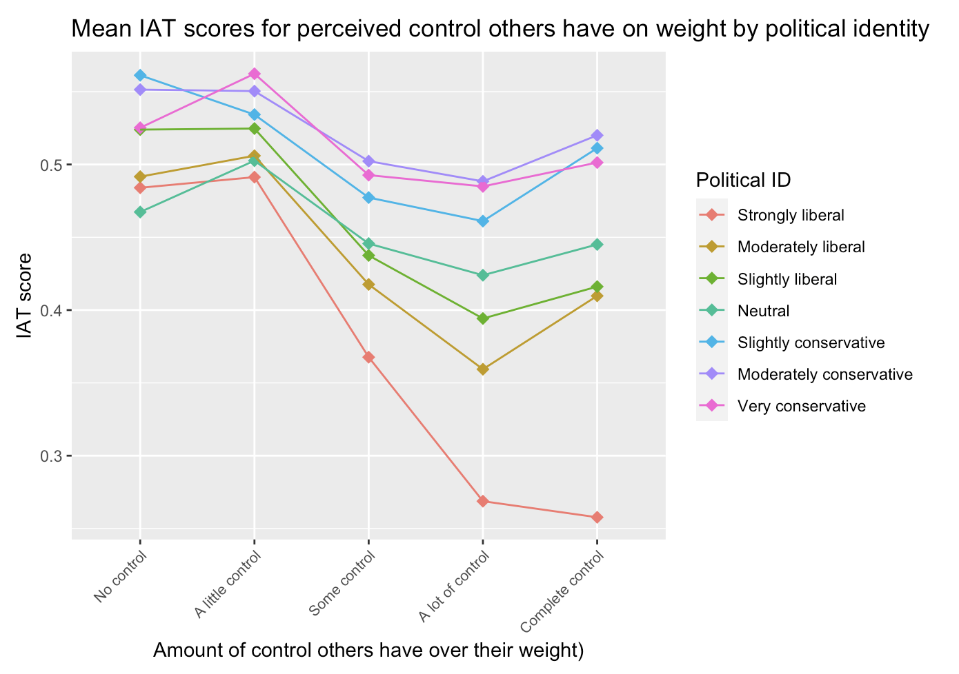
About confounders and effect modifiers
When hypothesizing whether a variable a confounder or effect modifier
Make sure to back any claims in your final report with sources
We can speculate what’s at play, but we can’t actually know
Our own identity may bias how we perceive specific dynamics
Education: I saw many of us speculate that higher education may be associated with lower IAT (as a potential confounder)
Data showed the opposite: higher education, higher mean IAT score
We can think about people’s perception of controllability of weight: do people assume certain behaviors about fat people?
Does that align with or go against people’s assumptions about behavior needed for higher education?
We also need to think about how education might be linked to socio-economic status, and how that might change what food is affordable
Heavily discussed in Maintenance Phase podcast, but I don’t have direct sources
Potential effect modifier from plots

Notes on plotting
scale_x_discrete(labels = function(x) str_wrap(x, width = 10)): use this to wrap the text on x-axis- Student used this and I loved it!
Keep your explanatory variable on the x-axis when you are plottinf three variables at once
hjustandvjustwill move your text on the x axis so it does not cover your plotPlotting age vs. IAT
geom_smooth()to show moving mean valueBoxplots and plotting each mean not exactly right for continuous variables
See Lab 4 for how I plot this!
In
geom_smooth(), when to usemethod = lm- Do not use if trying to see how data look
As we go into Lab 4 and Project Report
If IAT score ranges from -2 to 2, what changes in mean IAT is a lot?
- 0.05: about 1.25% change
- 0.5: about 12.5% change
A lot of the coefficients may be significant, but are they clinically meaningful?
Quiz and Lab 2